Philips Hue Smart Button (review)
As with the preceding year, Philips Hue never seems to disappoint, with a swathe of product releases being unveiled or leaked over the spring and summer of 2019, culminating in the eventual availability of four different Filament bulbs, smart plugs suitable for a variety of regions, updated products that now include Bluetooth connectivity in addition to ZigBee, and finally the new Philips Hue Smart Button, which we’re looking at today.
PACKAGING
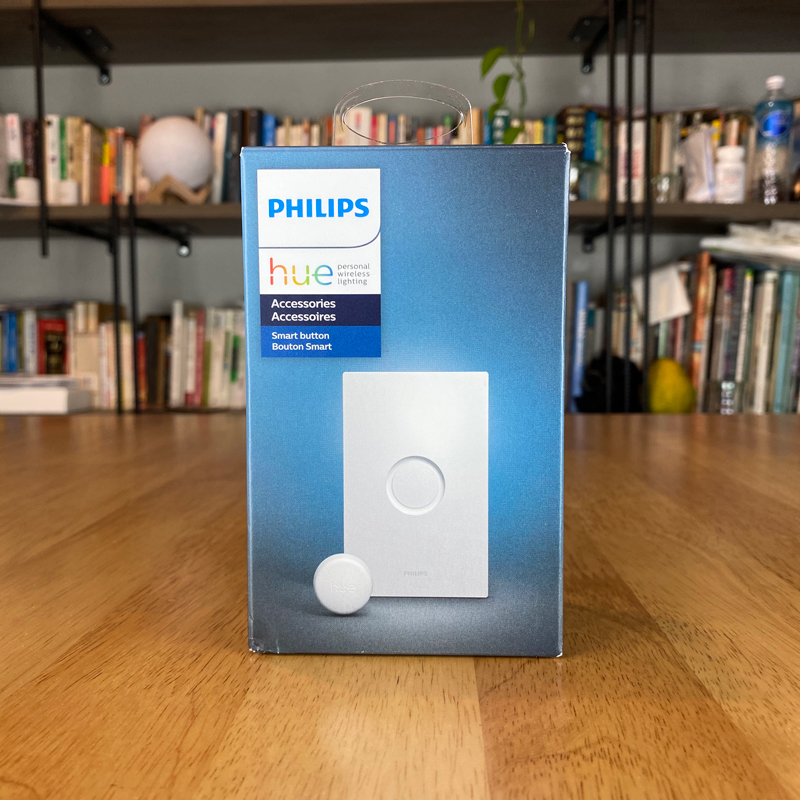
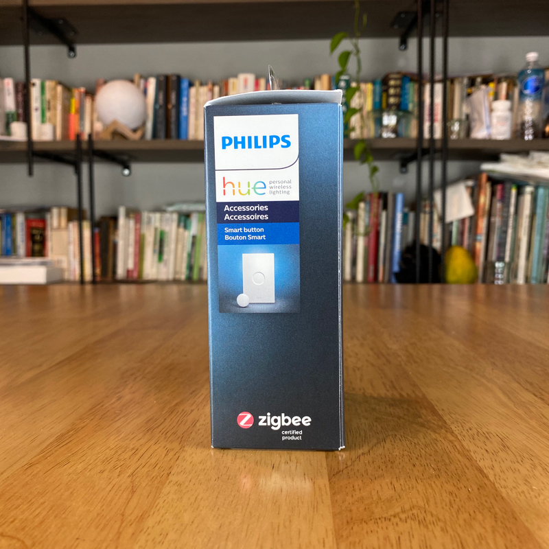
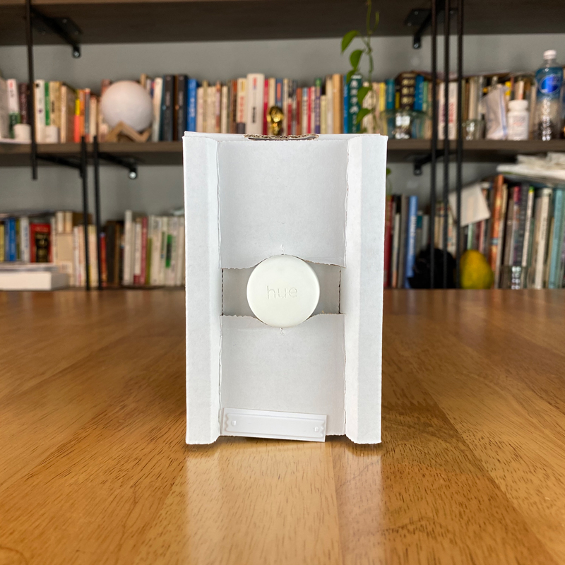
In terms of packaging and presentation, there’s not a lot to say other than Hue definitely have their own style, and are always keen to keep brand continuity at the forefront. So with the box here, if you’ve seen any other Hue packaging previously, you’ll immediately recognise the styling here. The front simply has the Smart Button, along with the wallplate, on the front. The side of the box has more of the same but with the addition of the ZigBee logo. It’s important to note that whilst many new and updated Hue products now include Bluetooth in addition to ZigBee, this isn’t the case with the particular product, so if you were planning on buying this to work with any recently acquired Hue bulbs with just Bluetooth usage in mind, this switch will not work with them, at least not until you add the bulbs to a 2nd gen Hue Bridge, at which point, the Bluetooth part of the bulbs stops and they begin using ZigBee (yes, it sounds complicated…).
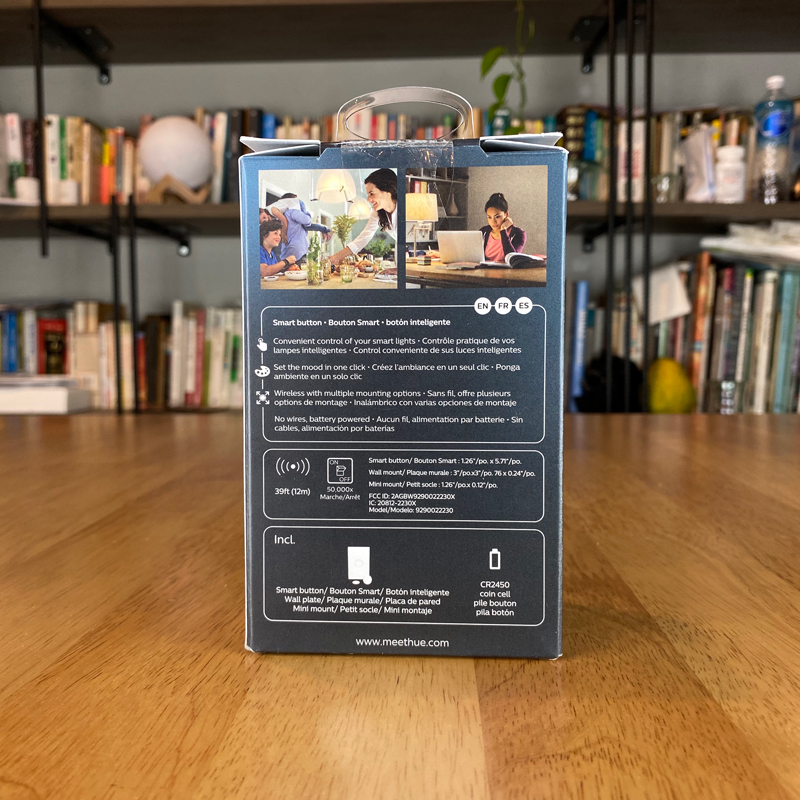
The rear of the box has the usual info you might expect of any electronic product and also has a little information on the basic features, including;
- The button uses a CR2032 coin battery (incorrectly states CR2450 on the packaging)
- the button is designed to withstand up to 50,000 presses
- has a range of 39ft/12m
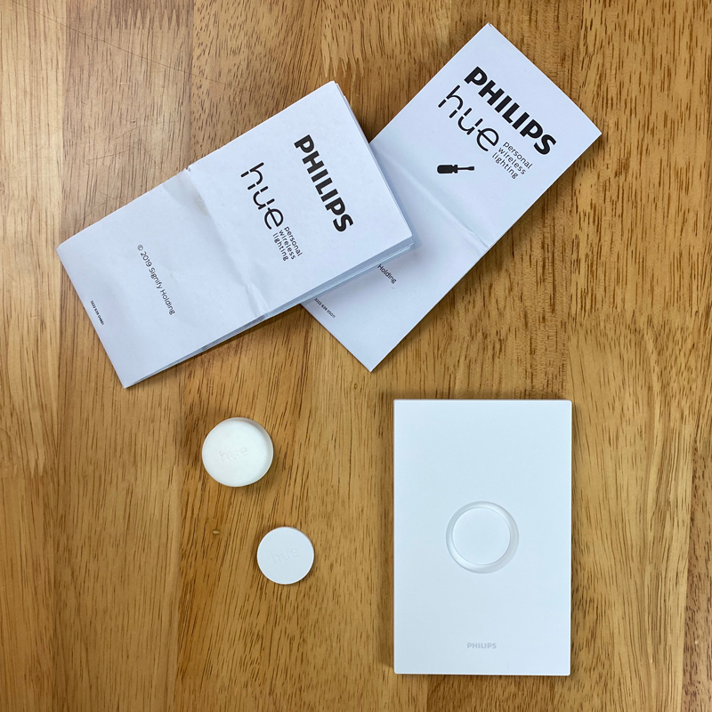
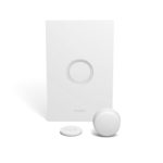
The button and the plates (yes there are two…sort of) are all well-protected with an inner corrugated card structure, although the button itself is only held in place by the edges of the cardboard, so when I received the delivery, the button was, in fact, rattling around the inside of the box. The contents of the box, as you can already imagine are scant, with just the main wallplate, a mini circular mount, two booklets, and the button itself.
THE BUTTON & PLATES
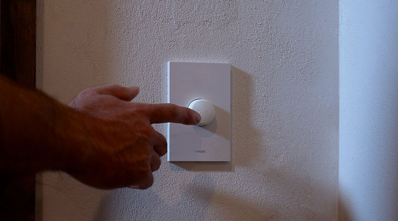
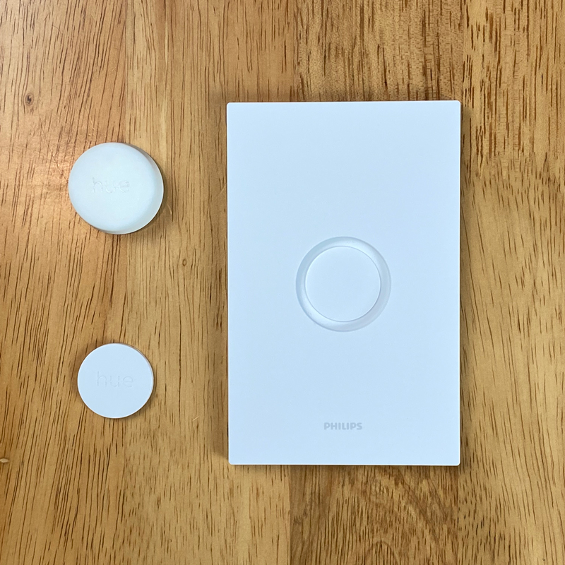
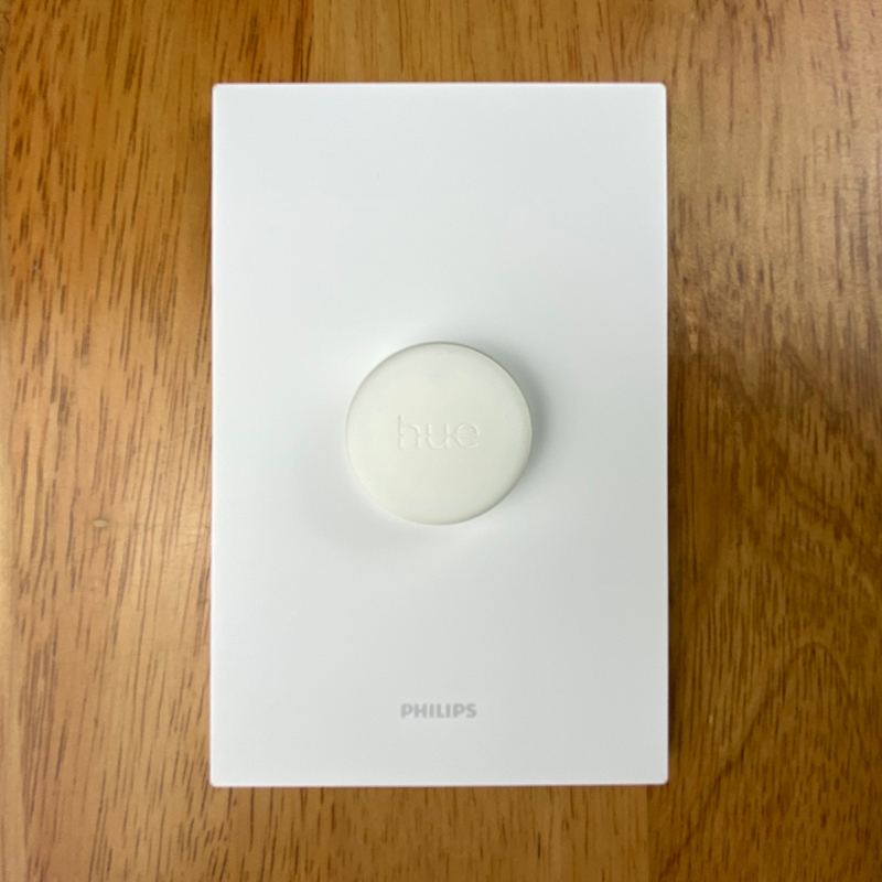
Onto the device itself, and before anything else, the one question that has already been asked a lot is, how does it feel when pressing it? There isn’t much ‘travel’ when you press the button, but it doesn’t require much effort to press it, and when you do, it doesn’t feel soft or ‘squishy’ under your finger. There’s a definite click, sound and feel-wise, although you’d really have to have it close to your ear to even notice any real click sound, so if you want something that emits virtually no sound at all, then this could well be the thing you’re looking for. Also included are the main wall plate and a circular ‘mini mount’. The button is magnetic and can ‘stick’ to either of these plates, although neither of these is magnetic by themselves.
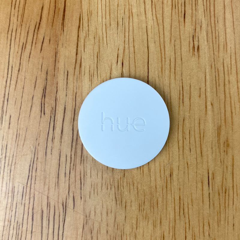
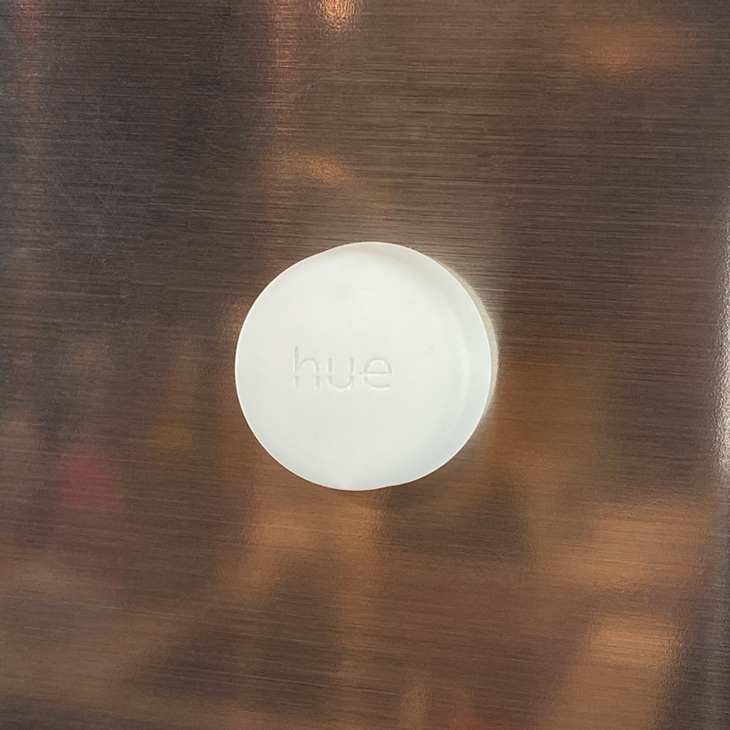
The front of the Smart Button has a debossed(?) Hue logo and not a lot else, which is fine by me, although I can easily see dirt building up inside the letterpressed logo over time. The material used for the button is, out of necessity, some kind of latex or rubber, which has a matt look and slightly velvety touch to it, which would also probably suffer from dirt from finger presses over time, but unlike a button made of PVC, which is generally easy to wipe, I’m not sure this material would be as easy to clean. To the untrained eye, it would be hard to notice a difference in the shade of white between the button and the plate itself, but there is a minute difference nonetheless, with the button having a slightly more creamy white hue, with the plate being a more sheer white. It’s barely noticeable at all, although it’s entirely possible that the rubber of the switch will turn more yellow over time, to make the difference more apparent. Come back in a few years, and I’ll let you know…
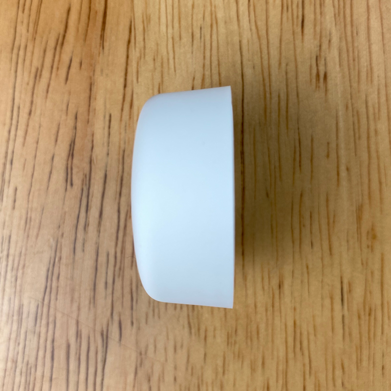
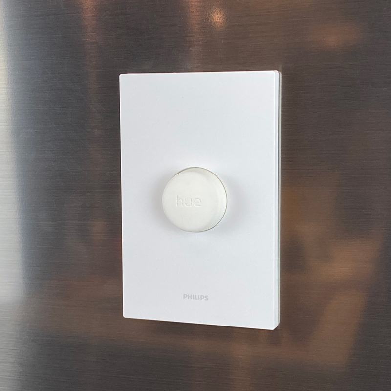
As you can see from the profile pic of the button above, it’s slightly larger at the base, coming in at 31 x 31mm/1.22 x 1.22in and 29 x 29mm/1.14 x 1.14in at the top and 14mm/0.55in in height. The full-sized wallplate is 6mm/0.24in deep, but because the wall plate has a bit of a recess for the button, the button and plate combined only come to 16.5mm/0.65in in total, which is only slightly deeper than the Hue Dimmer switch at 14.25mm/0.56in. The Hue Smart Button also has an LED under the ‘skin’ of the button, which flashes when you press the button.
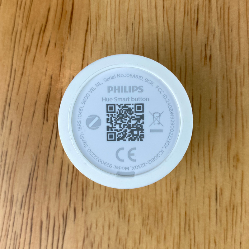
Getting into the battery compartment does require a small screwdriver or some similar tool, and while it’s not massively difficult to get to the battery, there’s easily the potential to mark or damage the body a little. Putting the battery door back in is also a bit fiddly, so take care not to break it when you try forcing the cover back on.
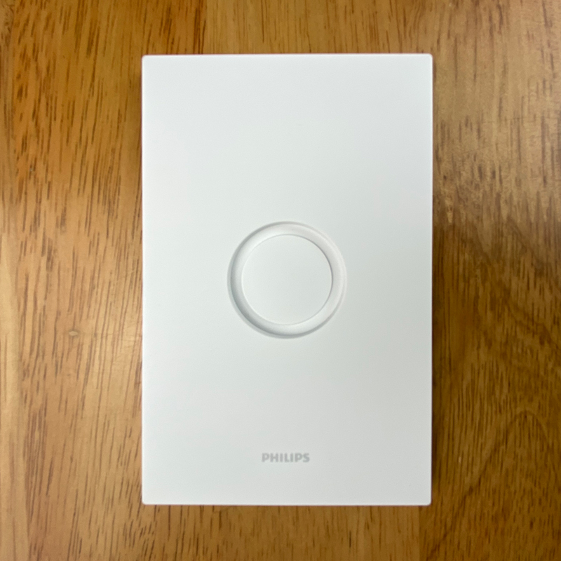
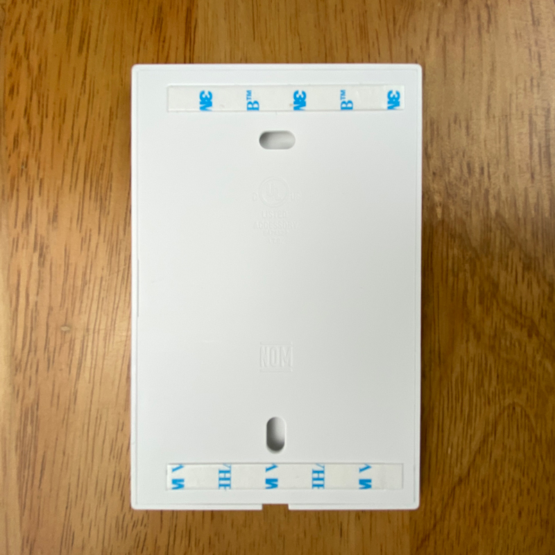
Hue has generously provided not only a regular wallplate but an additional mini mount, both of which use 3M double-sided tape in order for you to mount them to a surface. If you’re not really keen on having a large wall plate, or simply don’t have space, then effectively the mini mount is small enough to stick anywhere and is also small enough to actually hide behind the button itself. In fact, if you wanted to literally just have the switch mounted somewhere, you can as long as the surface is magnetic, although you’d be limiting yourself a little, given you can place the mini mount almost anywhere regardless of whether the surface is magnetic or not. Utilising the mini mount adds a mere 2mm/0.08in to the overall depth of the switch. The Mini mount also has the same Hue logo, whilst the Wallplate has the Philips logotype on the bottom.
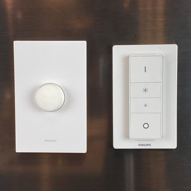
The ‘standard’ wall plate is actually slightly bigger than the Hue Dimmer Switch wall plate, coming in at 124 x 79mm/4.88 x 3.11in, with the original Hue Dimmer only 115 x 70mm/4.5 x 2.8in. Although it’s a small detail, it would have been nice to have included some magnets to the wall plate, as is already the case with the original dimmer plate, which would have made it really convenient to have it in many more places, whilst allowing you to move it around, which, with double-sided tape, isn’t exactly an option.
SET UP (HUE APP)
As with any Hue product, you have to add it to the Hue app in order to get it exposed to HomeKit. So, assuming you’ve got the Hue Bridge and the app, it’s all very straightforward.
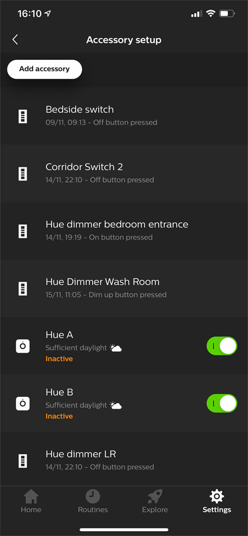
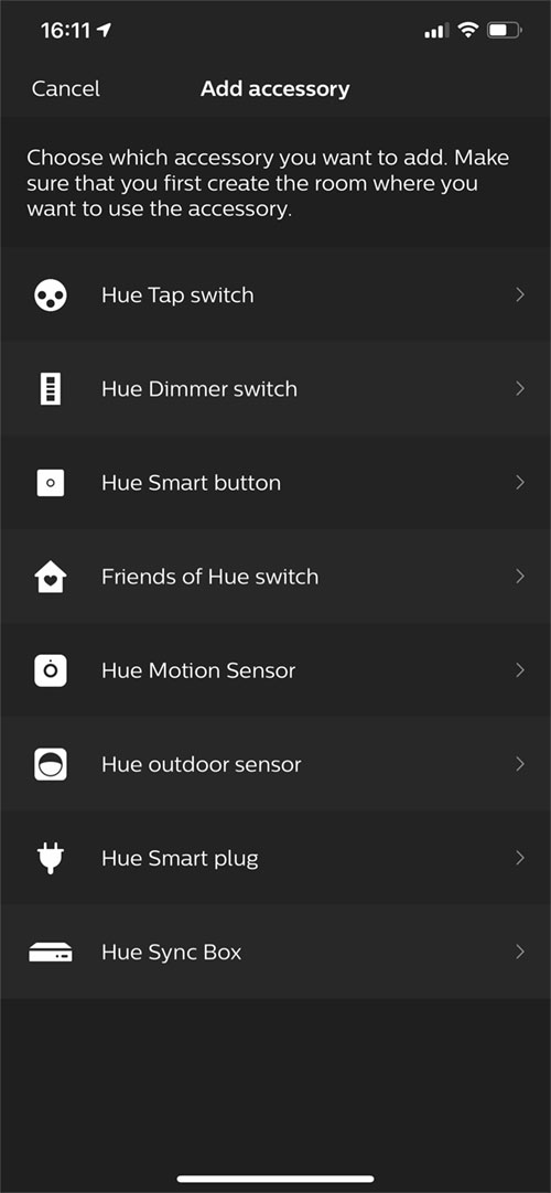
- In the Hue app, click on Settings > Accessory setup > Add accessory
- From the list of options, select Hue Smart Button
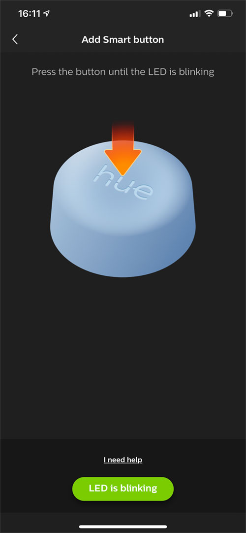
- Press the Hue button until the LED starts blinking
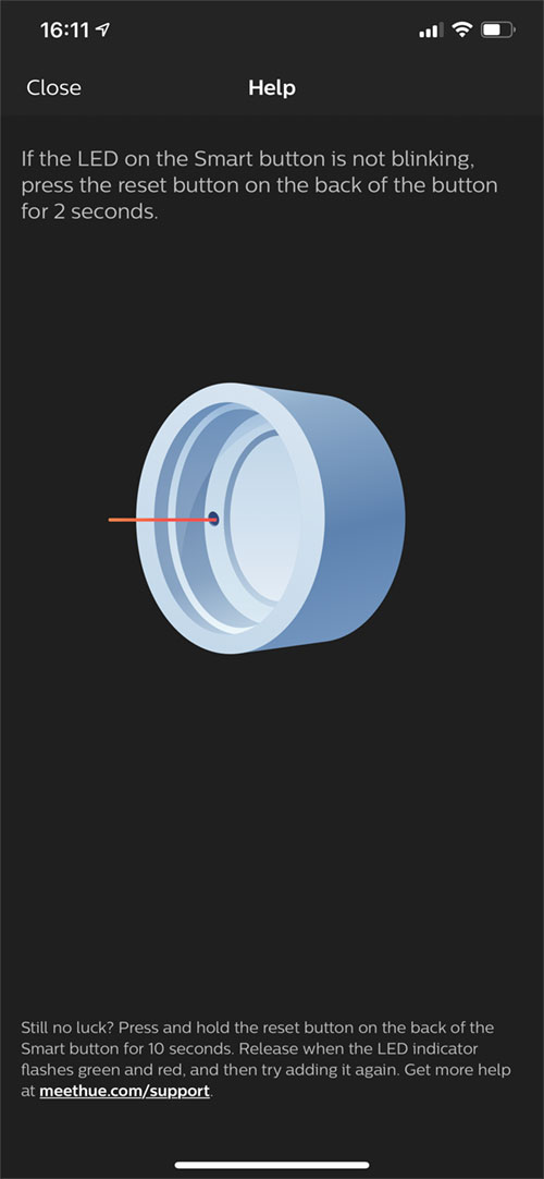
- If you encounter any issues with the button not connecting or even no flashing LED showing, you can reset the button with the reset hole inside the battery compartment of the button.
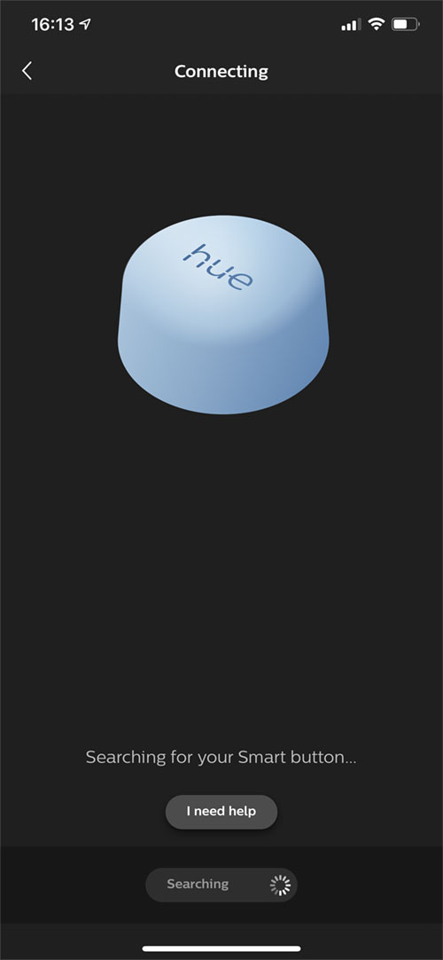
- The app will begin searching for you button and will eventually connect.
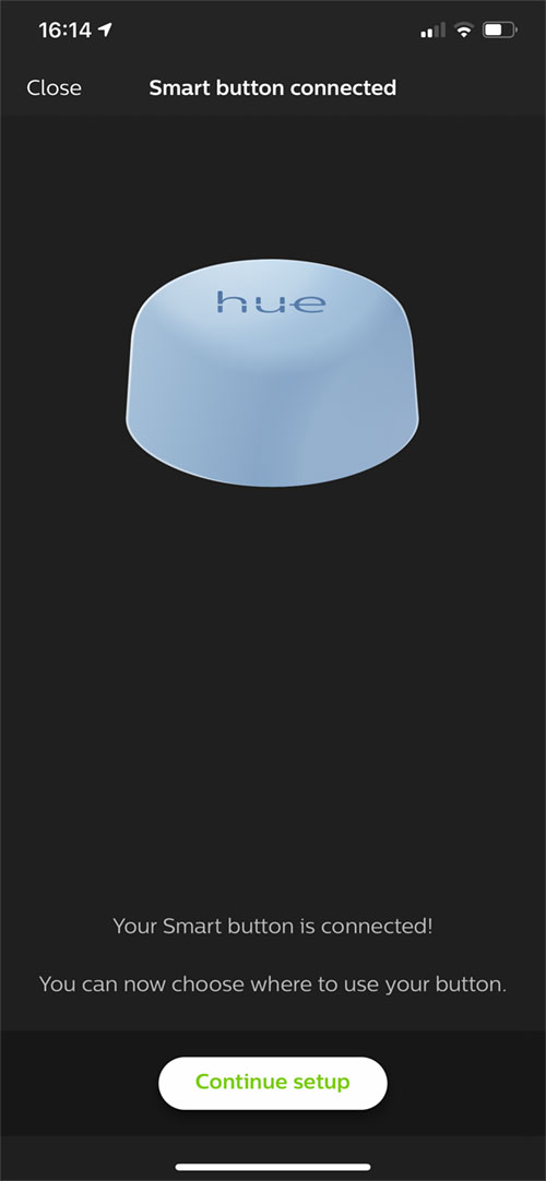
- Press Continue setup
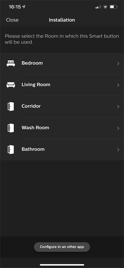
- If you intend to solely use the Hue app, then you can choose a room for it to be located in. However, you can still add it to a room, and also have it in the Home app, if you wish.
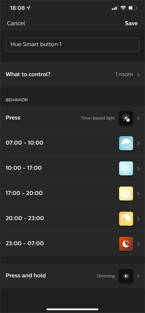
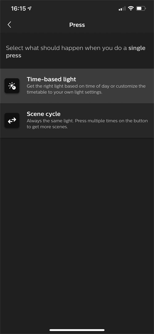
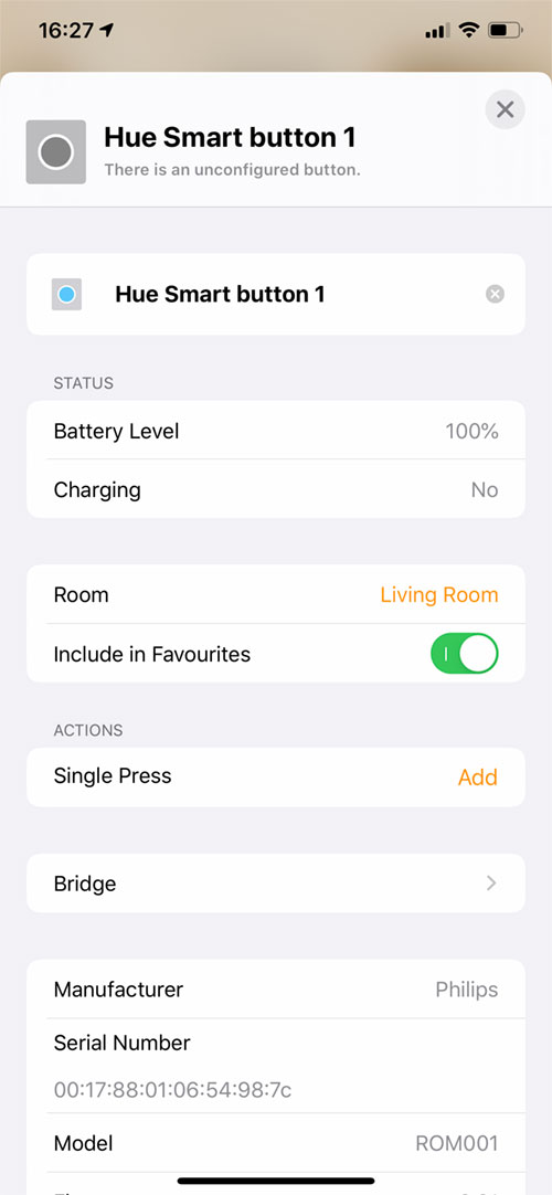
- The Hue button has two distinct actions to choose from – Single Press and Long Press
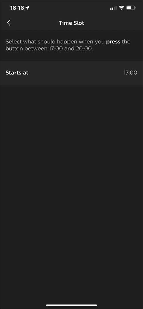
- With Single Press, you can choose whether it uses time-based automations or cycles through a set of five different scenes
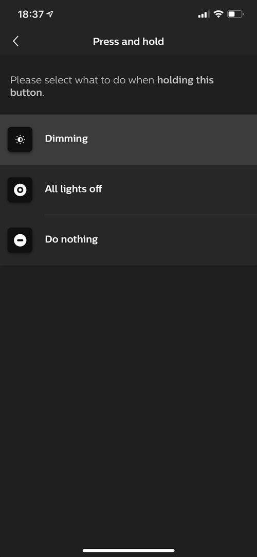
- For Long Press, you have three options; Dimming, All lights off or Do nothing. For dimming, you press and hold the button and the lights will dim down as you’re pressing the button
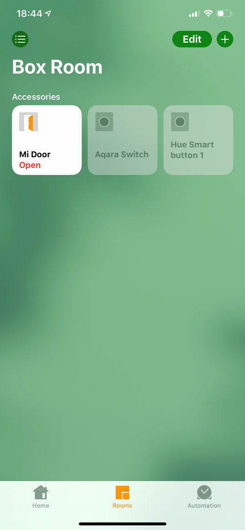
Once the button is all set up, it will appear in the Home app in the room you assigned it to in the Hue app. If you didn’t assign a room in the app, you can assign it in the Home app as normal.
IN HOMEKIT
This is where, in my opinion, things take a slight turn for the worse. Not because the product itself is bad, faulty or unreliable – it’s none of those – it’s simply due to the fact that when it’s exposed to HomeKit, you only get one action. So there’s no single, double and long press – just single press. It has to be noted that this is exactly the same for the Hue Dimmer switch, with each button only having one option, but I’d still argue that this is where I think it’s severely lacking. It costs around the same price as the Hue Dimmer, but you only get a quarter of the functionality. And whilst the button itself takes up very little space, with the wall plate, it actually takes up just as much space as the Hue dimmer (fractionally more in fact). Obviously, it would go against the whole way switches and buttons work with Hue if it were to have the functionality we already get with other HomeKit buttons, like the Eve Button, for example, but it seems like a wasted opportunity to not add – at the very least – a long press, especially when long press is an option in the Hue app.
There are, of course, ways around this, so you can have it so that the single press action can toggle between on and off, but this requires the use of a third-party app, like the excellent Eve for HomeKit, just to get it the most basic of use out of it. I would suggest that it has its limits even within the Hue world, but then maybe this is designed to provide more of a focused function rather than be an ‘all-bells-and-whistles’ type of device. As it stands in the HomeKit world though, it’s really a one-trick pony ( or should that be a one-legged pony?), which is somewhat of a disappointment.
IN DAY-TO-DAY USE
As it happens, I do have a quite specific use case for this Smart Button, which really only requires one function. My elderly mother-in-law often needs assistance with opening jars and containers or reaching stuff on high shelves, and so by pressing the button, she can trigger a very specific scene that lets me know she needs assistance. As it only has the one function, there’s no need to explain complex instructions to her, or any chance of triggering anything else, due to the fact that it can only do the one thing in HomeKit. I previously had this functionality tied to an Aqara smart mini switch, but as that has double and long press options, then there’s always the potential for a mistaken press.
So far, the button has been a ‘hit’ in this respect, and it small enough to not be a dominant feature where it’s kept, and because it’s magnetic, she can pick it up and place it back with a fair amount of ease. There have been no issues with unresponsiveness, but given how generally solid Hue products are in this respect, I didn’t really have any doubts about that at all.
It Hue had somehow been able to include a way of letting the switch rotate whilst it was held in the wall plate, that would allow dimming in a rotary fashion, it could have held a more unique place, albeit just in the Hue app, but sadly I think if it had some form of functionality of this sort, we would have found out by now I imagine.
Summing up, I’m pretty torn, as if it wasn’t for the aforementioned use case, it would really be of little use, when I’m so used to a world where double and long presses are the norm. But I do like the design, and I do like the solid Hue system. It just falls short when it comes to HomeKit functionality, and that’s a real shame. My suggestion would be to seriously think what you could possibly use it for before spending the even modest price it’s asking, otherwise, it could end up sitting in a drawer until you do.



I have a similar use for this button, kind of a panic button for my older kid so she doesn’t wake up the younger one. My question that I can’t find an answer to is regarding notifications. I know that you can set a scene, but can you also have HomeKit generate a notification upon pressing the button?
Hi, I don’t think it’s possible to get push notifications for buttons, like you would with sensors for example. The only workaround is to create a scene that triggers a colour light or lights, so you know the button has been pressed. There may be a way with Siri Shortcuts. I’ll have a look and see if it’s possible.
I wanted to use it for the Porch light. One press to switch it on and have it go off after 10 minutes. Unfortunately this is not possible with the button as it is not available in routines. What a missed opportunity 🤔
This device does NOT use a CR2450 battery, it uses a CR2032.
The text on the box is a misprint. There is no way the CR2452 will fit.
Mine arrived with a dead battery – I used two CR2016’s successfully.
Thanks Andre, I just double checked and you are correct, I will update the article to reflect this.
Please can you explain how to get the battery/ies out to enable replacements. Many thanks.
Look for a little indent on the underside. Use a tiny screwdriver and carefully pry the disc off – yes, you might mark it up a little. Use the same screwdriver to pop the battery out.