‘HomeDash’ for iOS (review)
£5.99 (UK) | $5.99 (US) | €6.99 (EU) | www.homedash-app.com
There are quite a few HomeKit compatible apps in the App Store these days; some are great at accessing the untapped functionality of HomeKit, and some are nice looking but pretty standard, whilst yet others are simply awful, with ugly interfaces and actually buggy and badly thought out. What they mostly having in common however is that they follow a tile based system to one degree or another. Not so with the new app Marcus Reul.
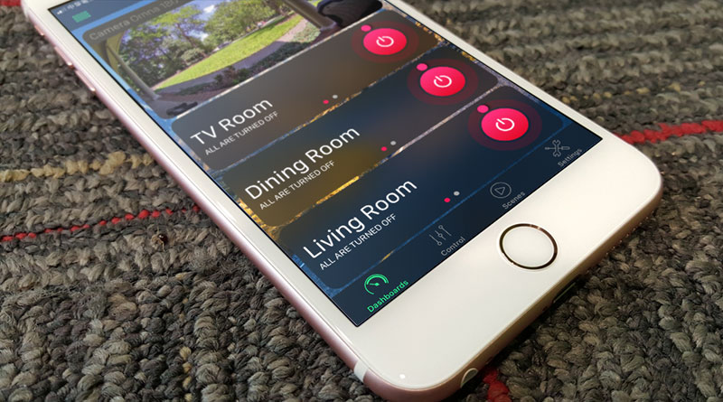
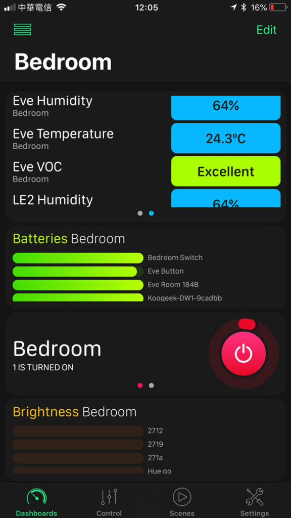
The first thing you’ll notice with the visual side of the app is that the tile concept has been replaced by panels of different sizes, with some offering slideable information within the panel itself. For example, in my bedroom there are four different devices that have a mix of environmental info (humidity, temperature, air quality etc.). If I add a panel to show this info, it will appear on the screen and allow me to scroll through the different readings within that panel. This allows panels to have lots more info, but all within a predefined space. Currently you can collate a variety of data from different devices, and have them in one panel – air quality, battery levels, contact sensors, humidity, temperature and volume, with light specific info on hue, power, saturation and brightness.
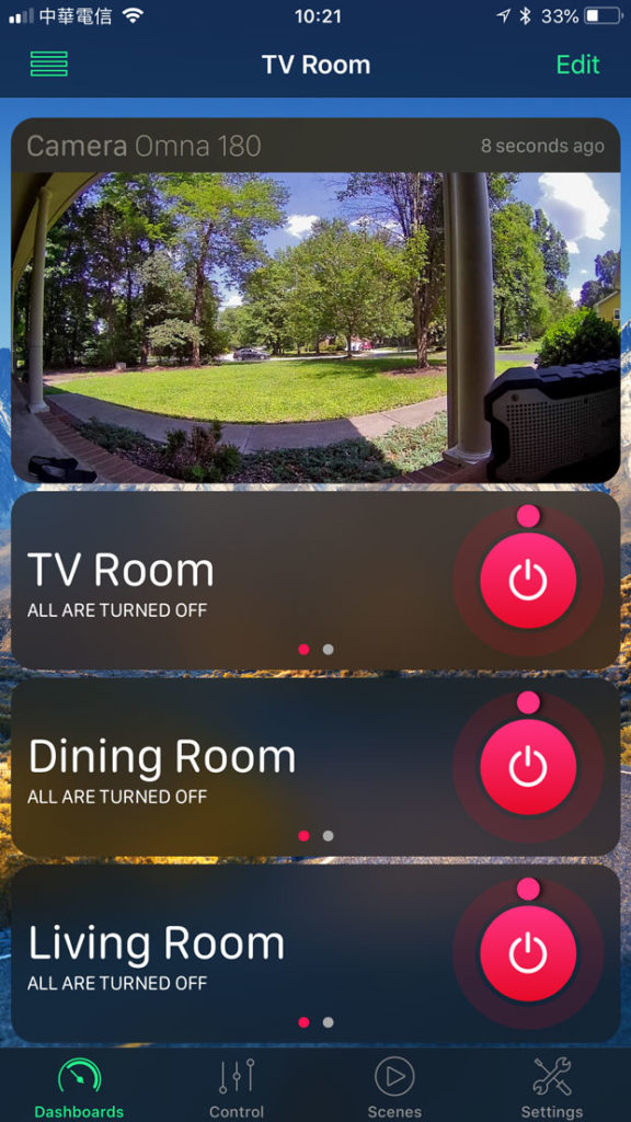
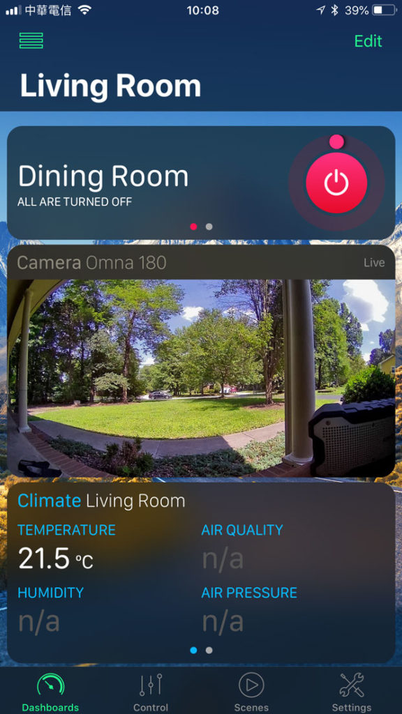
Some panels are larger than others, so the camera panel is the width of the screen, like all the panels, but its depth/height is determined by the camera screen itself. If you have lights or switches with dimmer functionality, then you can have a panel that’s quite thin compared to the others, as it only has a slider and ‘min’ and ‘max’ buttons on either side.
The different way of presenting info in a panel format as opposed to standard tiles is one thing that makes this app different from most other apps, but the even more original aspect is being able to present a particular type of info from different devices all together in one panel, so if I want to know the battery levels on those devices in different rooms that are all battery-powered, then all that data can be held all within one panel, which makes it quite convenient to see battery statuses all together, allowing comparisons between devices in terms of battery usage.
There seems to be colour coding applied to different types of data – green for battery levels and door/window sensors, blue for climate, heating controls and connectivity, red for power, orange for brightness, dimming controls and light colour and turquoise for cameras. This aspect, while useful for some, isn’t so great for me, as I’m personally a fan of less colour, and against a dark background (I couldn’t find a Light theme option) it was all a bit too ‘neon’ for me, but it may work for some.
Just like most HomeKit apps, HomeDash allows for different rooms to be displayed, however whilst the official Home app restricts devices to only appear in their respective rooms, HomeDash allows you to have any device (and its info) appear on any screen/room; in the Home app, my camera feed appears in the ‘living room’ screen as this is where the camera resides, so if I’m in the ‘bedroom’ screen and want to see the camera feed, I have to go to the ‘living room’ screen. HomeDash does away with this and allow any device to appear on any room screen, so I can literally add the camera feed to any or all of the rooms should I want. Likewise I can have battery or dimmer controls for the TV area, appear on the Bedroom screen. It really is quite customisable.
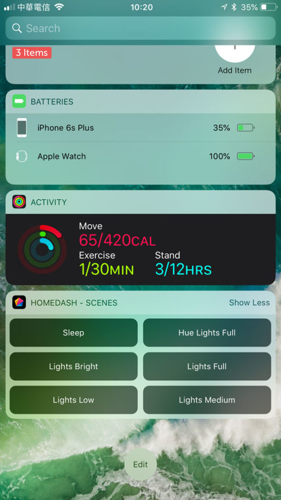
If you’re a fan of the Today Widgets panel on the iPhone/iPad, you can add a widget that contains your favourite scenes, giving you quick access. You can also do this on the Apple Watch, which is quite handy.
Having said all this, personally, I actually prefer the simplicity and ‘clean lines’ of the official app, so the splashes of colour along with the large panels is not something I’m a fan of, despite the fact that this app is very, very customisable. What I do use it for is the widget, which is great for quick access to scenes. This can be achieved with the official app in the shortcuts panel but you’re restricted to the first 9 scenes, whereas HomeDash allows you to choose your scenes. If you’re not bothered by the visual side of things, and love great customisation, then this is the one for you.

