‘HomeCenter’ For TVOS (review)
£12.99 (UK) | $12.99 (US) | €13.99 (EU) | homecenter.ai
Today we have a look at one of the few available ‘Home’ type apps currently available for the Apple TV; the new offering, called ‘HomeCenter’, by developer Oleg Chelbaev.
First of all, there are a lot of people that think that an Apple TV ‘Home’ app is pointless, stating that it’s counter-intuitive, especially when you have Siri at your disposal to make things as ‘hands off’ as possible. They do have a point, and in my experience of using this app, it’s not my ‘go-to’ way of controlling things. That being said, I still think there’s scope for special uses in having an app on the TV screen. There have been times when I’ve not had my iPhone to hand or it’s charging on the other side of the room, especially late at night in bed, then using the TVOS app is certainly not the worst option. The other thing to consider is for people with disabilities, who can’t easily walk across the room to grab their phone, or possibly those with speech impediments, which excludes Siri as an option.
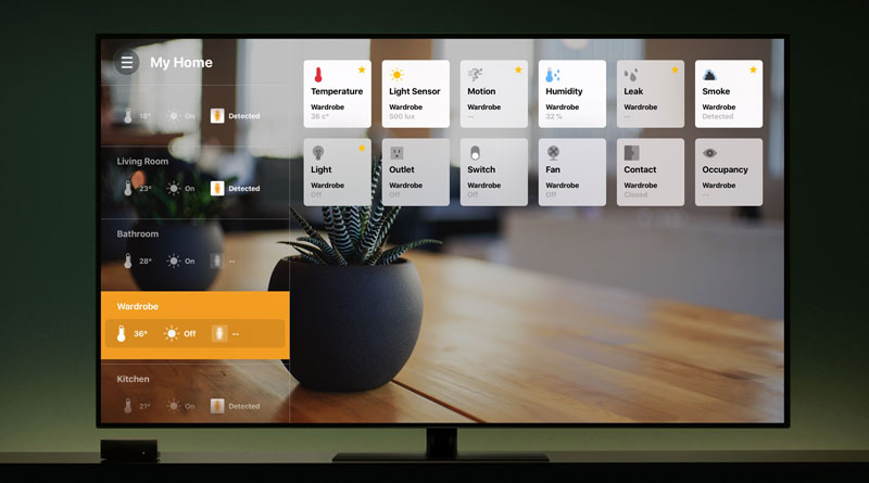
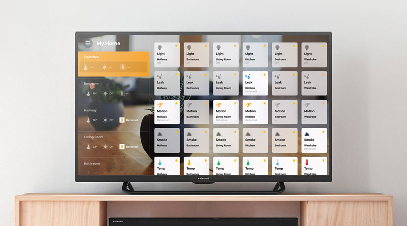
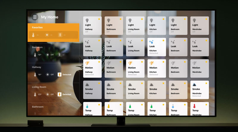
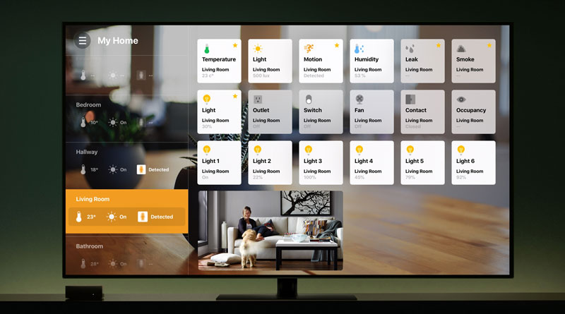
So, is it any good? Well it’s as good as you’re going to find currently. The design, which I alway find important, is actually very good. The developer has obviously taken his design cues from Apple, which is no bad thing. If you’re a fan of the official Home app, then the layout is fairly similar. The screen shows the different rooms on the right hand side, with little ‘quick look’ icons for temperature, lights and motion, which indicate whether lights are on, motion is detected and what the temperature is for that room.
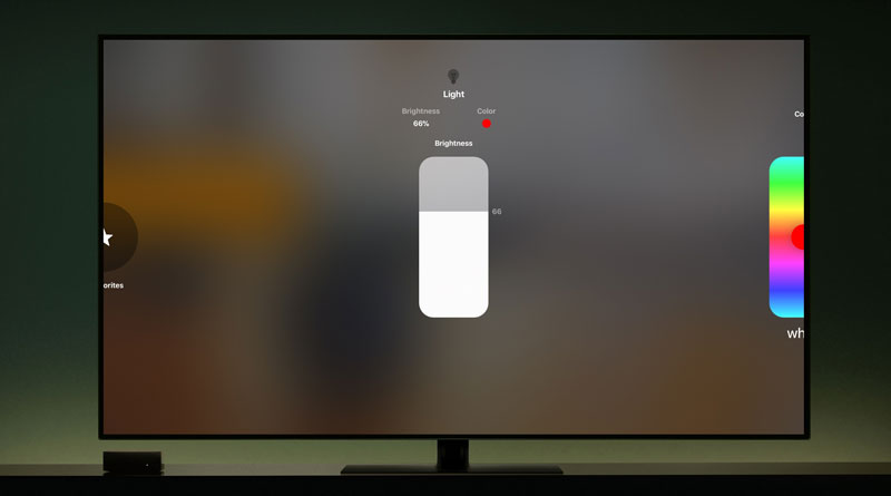
Taking up 75% of the screen are tiles representing each device in a given room, once again much like the Home app. You can click on these tiles, and depending on what the device does, you’re able to control aspects of the device – if it’s a light, it can be turned on or off. In addition, if it is a light, a long press will allow you access to further options, like brightness and colour on top of being able to add the device to your ‘favourites’. One thing the app is sorely missing is the option to group lights; I have 6 Hue bulbs in 3 rooms – so two in each room – and I’ve grouped them in the Home app, but here they appear as individual bulbs, with no way to group them. Hopefully this will be added in a later update.
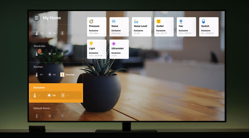
Along with each room, as indicated, you can choose which are your ‘favourites’ and have them stored on a separate panel, which is at at the top of the list of rooms on the right hand side. Nearly all types of readings can be displayed for each device, like motion, temperature, water leaks etc. but in my case I have an Elgato Eve Room and a Kaiterra Laser Egg 2, both of which appear on screen and display humidity and temperature, but don’t display any info regarding air quality, so there’s something missed out in that respect, despite the developer claiming ‘exclusive services’ like air pressure, noise, noise levels and ultraviolet, for which I don’t have devices.
Alongside all of the control you have over your devices, you also get to access any HomeKit enabled cameras you might have, so a simple click on the small preview screen opens up the camera into full screen mode, which is nice. It’s also very quick.
I for one, think it’s a worthwhile addition to my collection of HomeKit ‘tools’, and while I can honestly say I don’t use it often – as I have my phone with me most of the time – I’m happy to use it on occasion and it gives me peace of mind knowing that it’s available if I’m too lazy to get out of bed! There are definitely those that can’t really see the point, and it’s very true that swiping your finger across the screen of your iPhone or iPad is definitely much quicker and intuitive than with the Apple Siri Remote, but as I’ve mentioned before, there are scenarios where this could be of great benefit to some people.

