New UI Settings for HomeKit Devices in iOS 13
Unsurprisingly, there will be a few changes to HomeKit and the Home app, as we’ve already outlined in a previous post, and one small detail that has been revealed to us by Charles from the Apple Users Group on Facebook is in regards to devices that may have multiple functions, like temperature sensors that also have humidity sensors, for example.
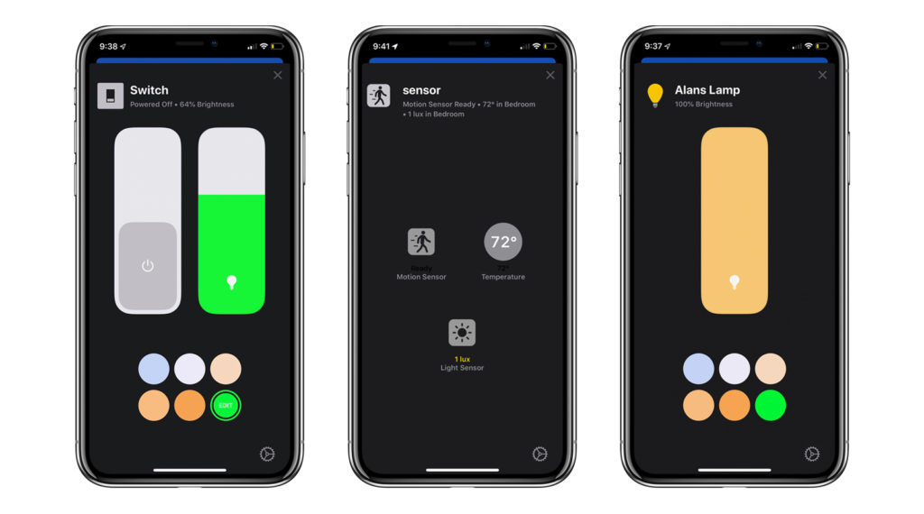
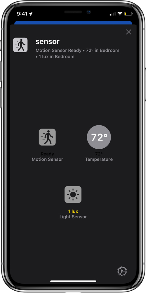
Currently, if you add a device, like the Hue Motion Sensor, you essentially get three devices in one, and correspondingly, you get three tile – one for motion, one for temperature, and one for ambient light levels. It would seem that in iOS 13, these three separate tiles will become one, and with the details for each sensor showing more details with (one presumes) a long or 3D press.
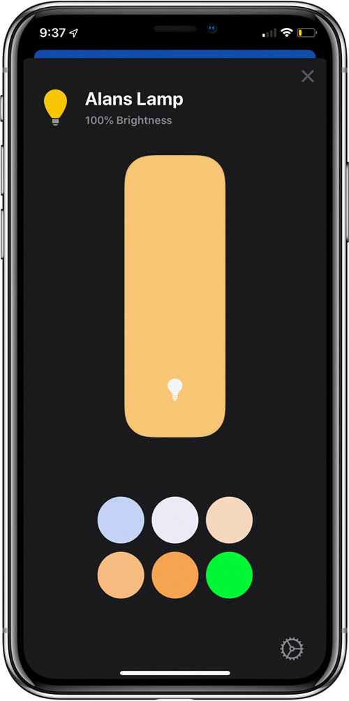
Whereas currently, you have separate sections for a brightness slider and a colour wheel, above you can see that in the first example, the colour and brightness options are now combined, which means you spend less time going backwards and forwards.
In the second example, we can see that the settings page for the tile that represents the Hue Motion sensor, now reveals the three different sensors together. Some people may prefer to keep them separate with a tile for each one, although at the moment, we’re unsure if there’s an option for this or not.
In the third example, you can see the settings panel for the iDevices Switch, which is essentially a smart plug with a night light built in. In the settings panel for this device (which also currently appears as two tiles in Home), you get the on/off switch alongside the brightness slider and the colour picker.
These are just a few examples of some of the changes that will occur with the Home app, and there are yet more changes that will surface in the coming months, so if you’re not a fan, don’t fret just yet, as things can – and often do – change.
Thanks to Charles for the screenshots.



Looks good! Are there new icons to choose from for lights, switches and outlets as well?
At the moment it seems the icon choices are still limited.
Too bad. How about icons for scenes?
These are all the same as well currently. Hopefully this will change as the beta progresses.
There is an additional option for fans though. The old one, plus a ceiling fan icon.