Yeelight Cube Smart Lamps w/ Matter (review)
When it comes to lighting products, I’ve had a long and generally good experience with Yeelight’s bulbs, light strips, and other smart lights – even when they’ve been rebadged for Xiaomi under the Mi/Mijia smart home brand. Not all of their products have been so great, but in the case of today’s review, I would argue that Yeelight has gone the extra mile – not only with a refreshing new angle on lighting but also for their dedication to the new smart home standard, Matter. Today’s product review is for the Yeelight Cube Smart Lamp, although as you’ll see, it’s not a lamp in any traditional sense, and ‘it’ should actually be ‘they’. Read on…
PACKAGING | CONTENTS
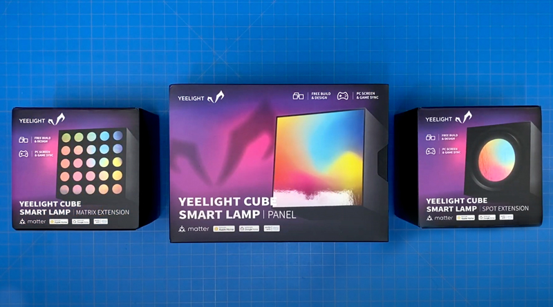
The Yeelight Cube Smart Lamp exists as three separate models; the ‘Panel’, the ‘Spot’, and the ‘Matrix’. Each of these is the same in terms of size and shape, but each offers something distinct. They can all work together, however. More on the differences in a bit.
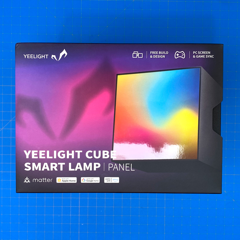
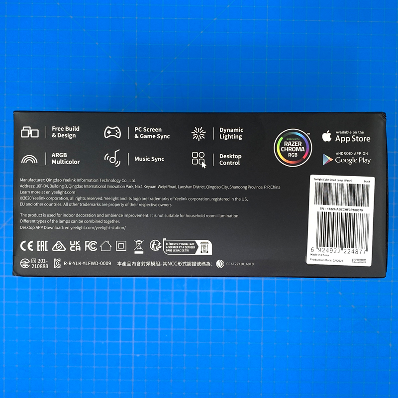
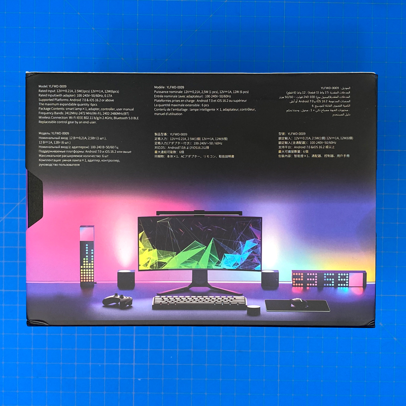
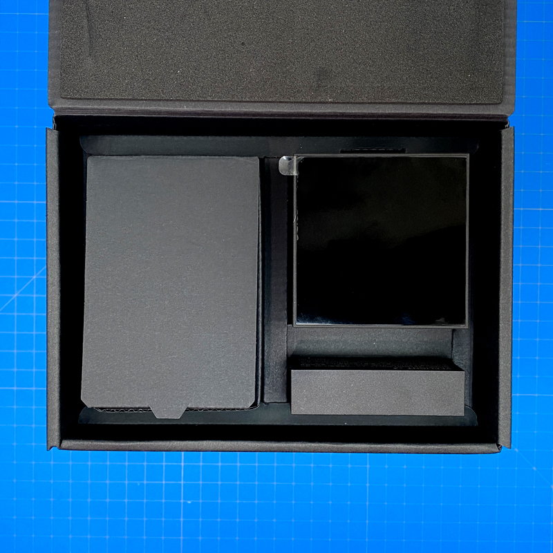
To slightly complicate things, each cube can be bought as part of what you might call a basic starter pack, which includes one cube and a base, which both power the Cube(s) and connects to your network, or as an ‘extension’, meaning you get the cube by itself, without the base to power it. In the case of the above, you can see this is the pack that includes the base and one ‘Panel’ cube.
The box for the ‘starter’ pack is larger due to the included power supply and aforementioned base unit.
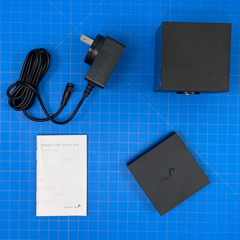
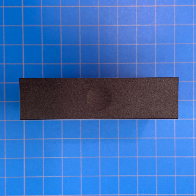
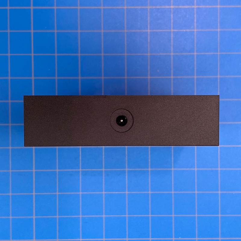
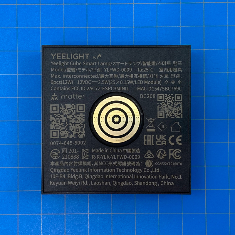
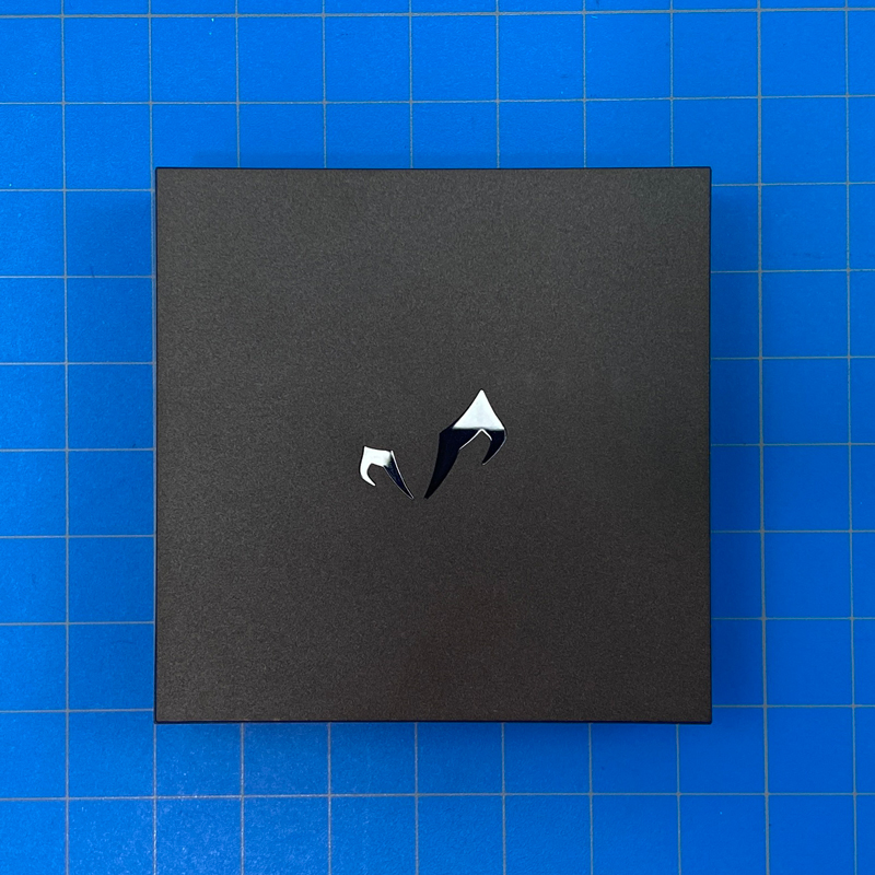
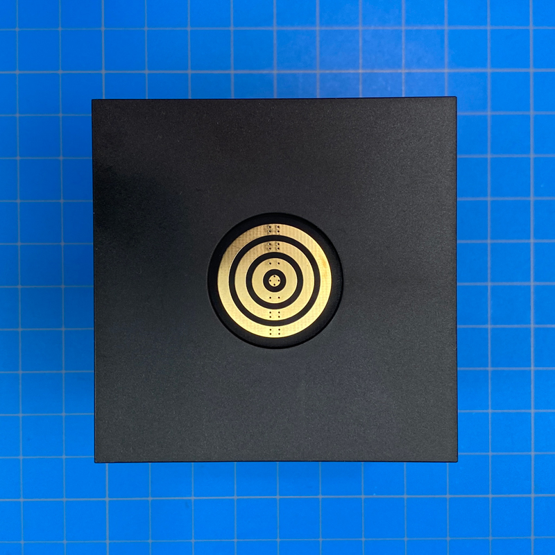
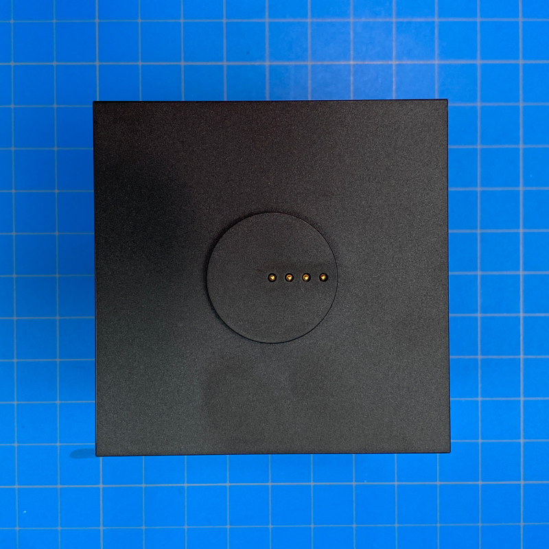
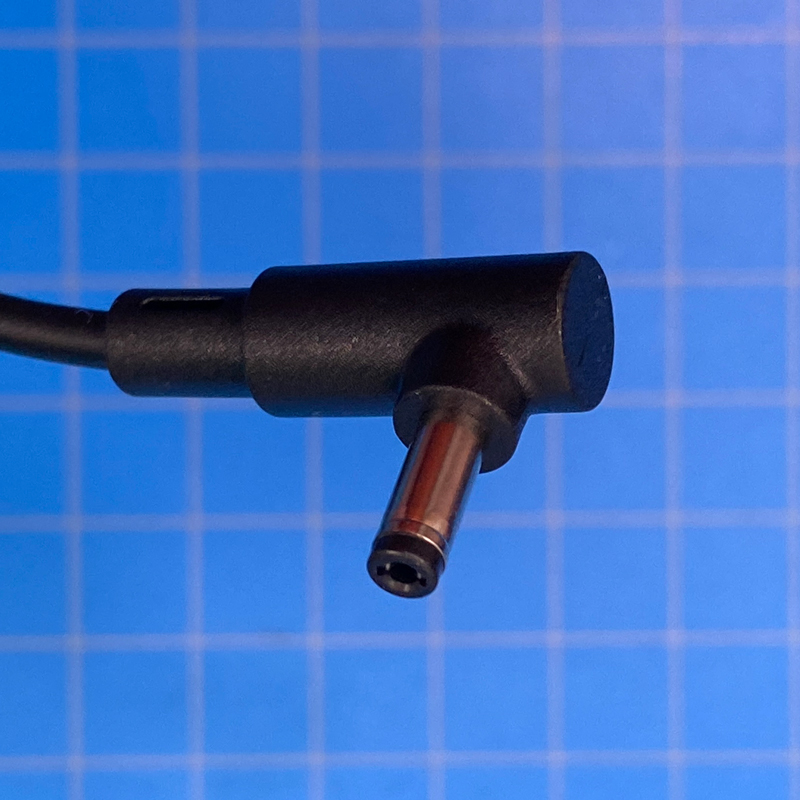
Starting with the base, which is actually the part that both connects to your smart home and your network. To connect to your home network, it uses standard 2.4GHz WiFi. It would’ve been nice to have seen Thread used here, but Yeelight doesn’t seem to have gone down that route, instead sticking with WiFi and Bluetooth Mesh for some of its other products. The base matches the cubes in terms of two of its three dimensions (square, essentially), with a touch-sensitive indent acting as a multi-function button on the front. The back of the cube is home to a coaxial port for the power supply, and the upper face houses a recessed circle containing four metallic rings. This is what transmits power and data from the base to cubes connected to it in series. The relevant information is etched on this surface as well, which includes not only basic electrical specs but also the Matter QR code. Yes, if you weren’t already aware, whilst this can work with HomeKit, it does so via Matter, so there’s no HomeKit code as such. As regards the aforementioned rings, each cube also has one of these sets of rings, along with an ‘opposing’ connection to pass on the power/data to successive cubes, which I’ll show you in a bit. The underside, which you’ll only see if the base is stood on its side, houses a stylised version of the Yeelight logo.
Onto one of the three cubes now, and as already mentioned, there’s an instance of the four recessed metallic rings on one end. The opposite end features a raised circle that’s home to four retractable pins. These, in case it isn’t obvious by now, correspond to the four rings. The back of the device is blank, and the front with the LED display has nothing of note unless it’s powered up, which we’ll see later.
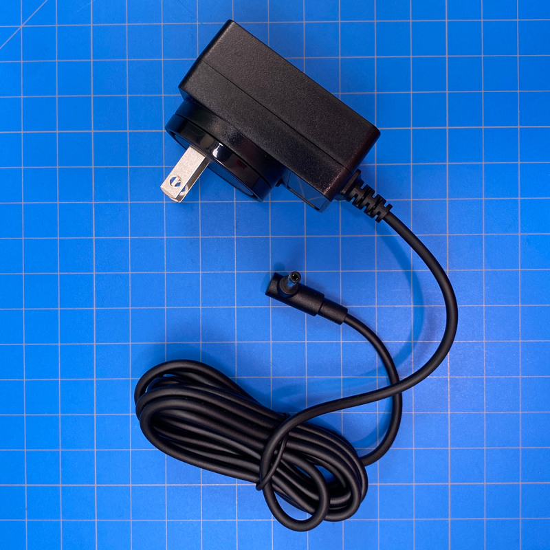
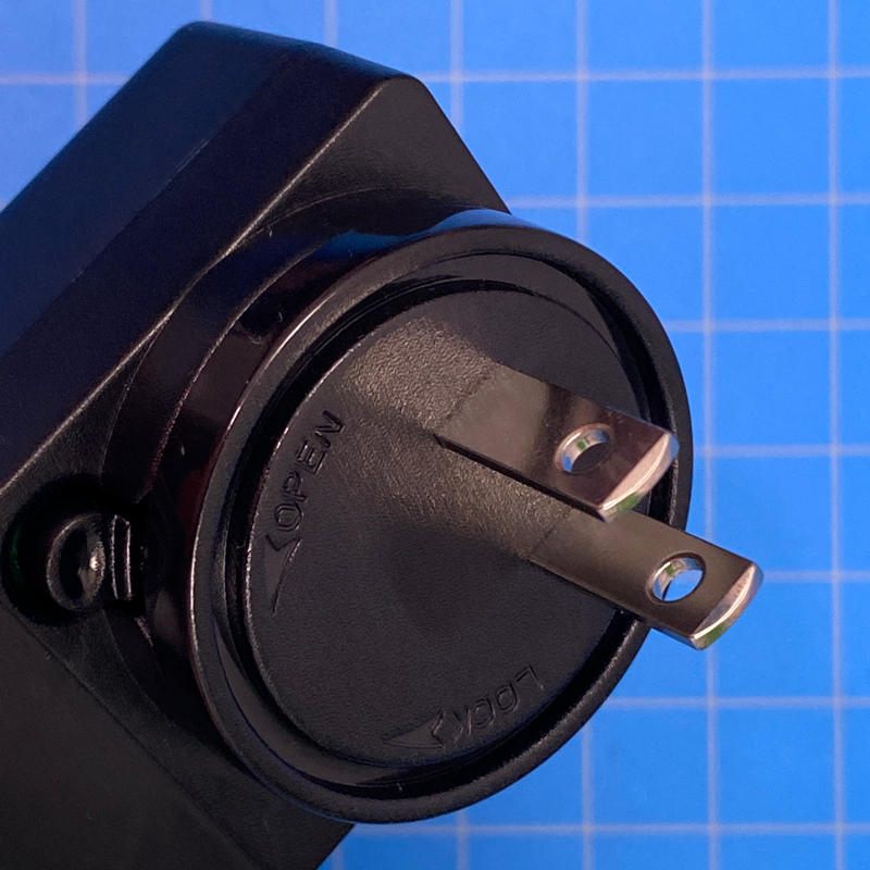
Finally, the power supply is of a design used by Yeelight many times. I’ve got the North American (Type A) version here, but the power supply has a removable plug, which can be switched out to one of three versions, depending on where you purchase this or where it’s shipping to, so you’ll get either a European adaptor (Type C) or a UK adaptor (Type G).
THE THREE CUBE VARIANTS
I’ve got all three variants here, starting with the…
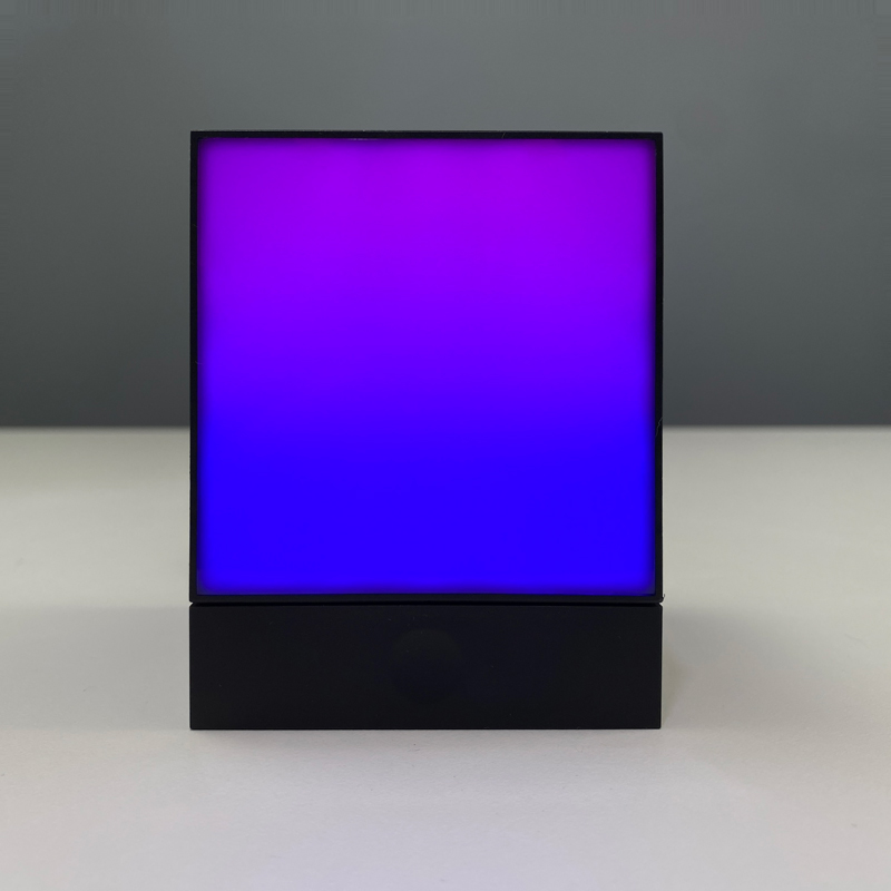
- PANEL: you can see it’s one large colour…panel, although underneath the diffuser it still has 25 individual LEDs like the Matrix. The diffuser merely blends the lights so that they create a uniform look. As it has 25 LEDs, it can display multiple colours at once.
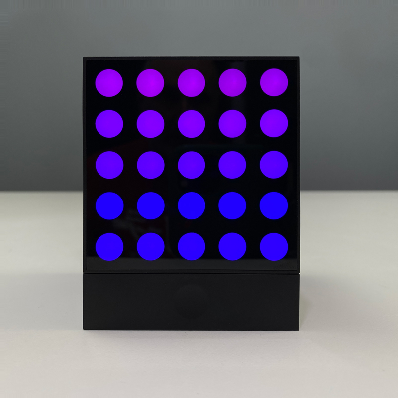
- MATRIX: This comes with the name for obvious reasons, and with this display, you get 25 dots each capable of producing different colours. As there’s no diffuser as is found with the Panel, you can create graphics and other images very clearly.
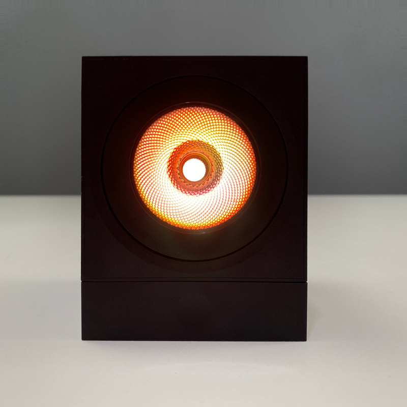
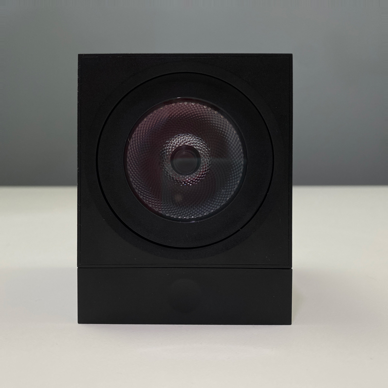
- SPOT: This option is only capable of one colour at a time, as it’s one large and powerful LED, with a built-in reflector to maximise brightness. What it does offer is the ability to act as a light to shed colour onto a wall or a ceiling, but it can also be angled to a certain degree.
PUTTING THEM TOGETHER
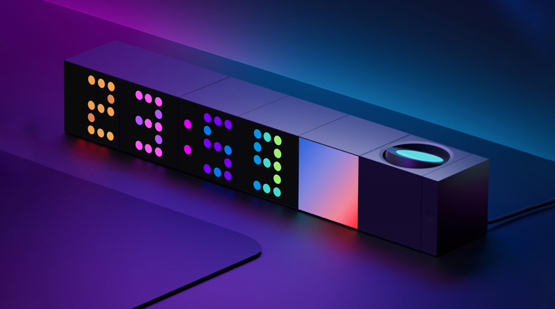
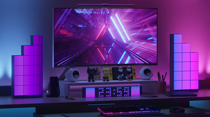
As you can see from the promotional image above, these can connect using the rings and pins I showed earlier, with a maximum of six cubes of any type connected to one base at any time. If you want more than six cubes, then you just set up another base unit, and add cubes to that base. Each Cube has magnets to help keep them stuck together.
The base unit, as previously stated, is what connects the Cubes to your smart home platform of choice with the included Matter code. In my case, I added the base unit to the Yeelight Station app, which is a new and separate application from the standard Yeelight app. This is specifically for the Cube at this time, but I’m sure it’ll be home to future smart home lighting products of this type at some point later.
YEELIGHT STATION APP
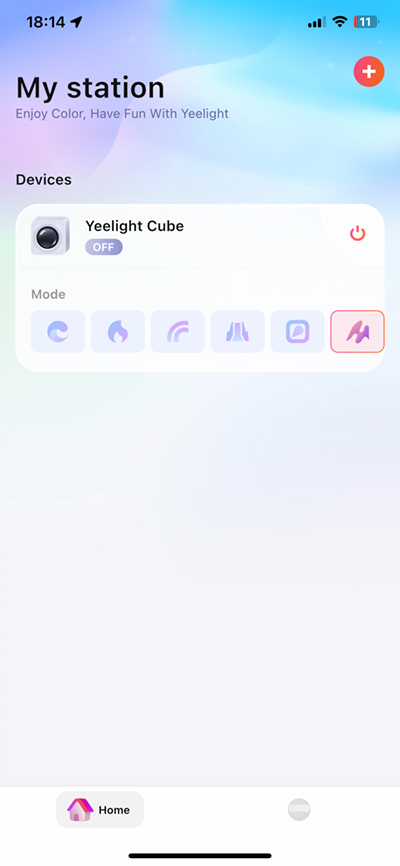
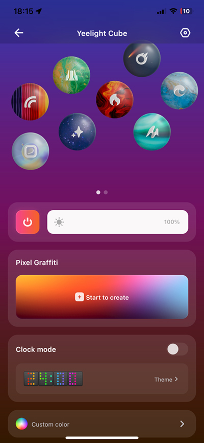
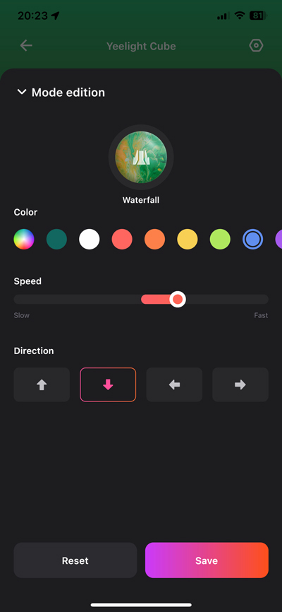
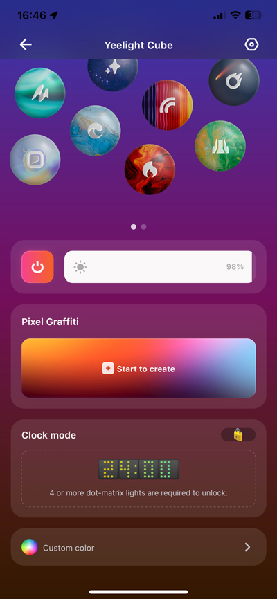
In the app, the main screen will show each base unit you have in a separate block, so in the example above there’s only one base unit. From there you can turn the base (and by extension any Cubes connected to it) on or off, or select one of thirteen preset ‘modes’ as they’re labelled, although I’d tend to refer to these as preset themes. Tapping anywhere else on the main device panel opens up more options, so the same 13 modes are available as floating ‘bubbles’ (spread over two screens) that give you a better idea of what each mode might look like, along with the descriptive name. Each mode also comes with an edit button to allow customisation of each mode. Depending on the mode’s theme, you can edit overall or individual colours, the speed of the animation, and change the direction of the animation, where available.
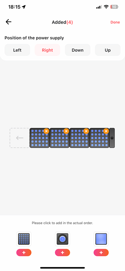
As the Yeelight Cubes are modular, allowing for a mix of types and amounts, you do need to let the app know the layout of the set of Cubes. Within the Device Settings menu, the Module Splicing option does just this, with a visual UI to allow you to add or remove different Cube types, rearrange the order, and select the orientation of the base unit. As previously stated, the maximum amount of Cubes you can add to a base unit is six. I assume this is due to power constraints, although if you set these to be upright, like a tower block, then any more than six cubes is likely an accident waiting to happen, which at worst, could injure a toddler if one of these cubes landed on their head (they’re not light and the corners are reasonably sharp) or at the least could leave you with a damaged, non-functional Cube.
The touch-sensitive button on the base unit serves three main functions;
- a single tap turns the unit and the Cubes on if they’re off.
- a 2-second press turns the unit/cubes off
- a 5-second press factory resets the base unit
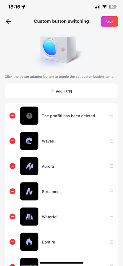
- a single tap when the unit is on, cycles through up to eight different modes
By default, six of the modes are already assigned, but you can assign any of the modes as well as your own designs if you wish. This is achieved via the ‘Custom Button Switching’ option.
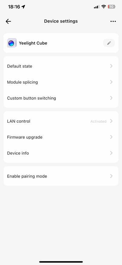
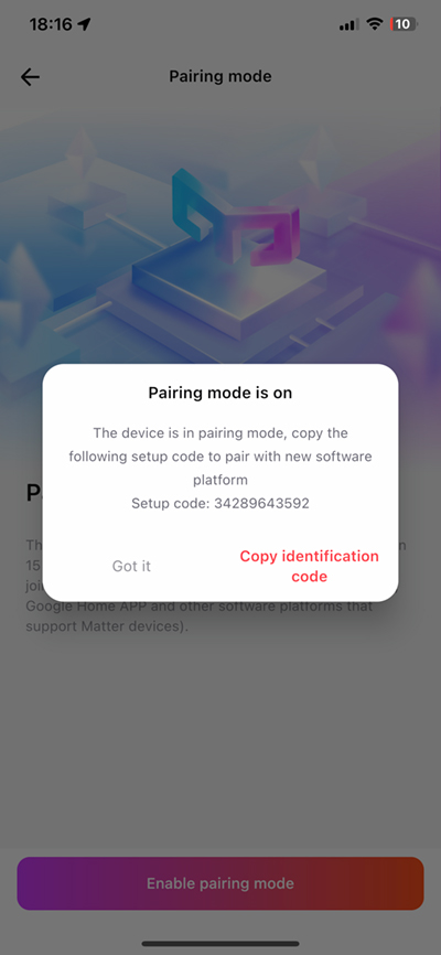
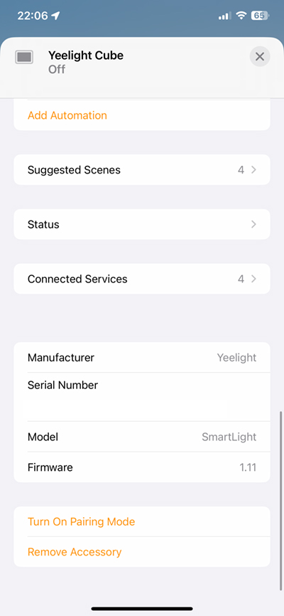
For a few other settings, the Device Settings panel allows for firmware updates, LAN control, and Pairing Mode for Matter. Even though the base units come with a Matter code, once that code has been used for one smart home platform (in this case Yeelight’s own system), it can’t be reused to add the device to additional platforms, so in my case when the base unit was added to the Yeelight Station app, in order to get it into HomeKit, I needed to generate a new code, that I could then paste into the Home app when adding it to HomeKit. This code changes each time the Pairing mode has been activated.
If you were to add the base unit to HomeKit first, you’d use the provided Matter QR code, then enable Pairing mode in the Home app for other platforms. This appears to be pretty much the same arrangement with Google Home and Amazon Alexa, although, at the time of writing, you can’t add Matter devices to these two platforms unless you do so via an Android phone.
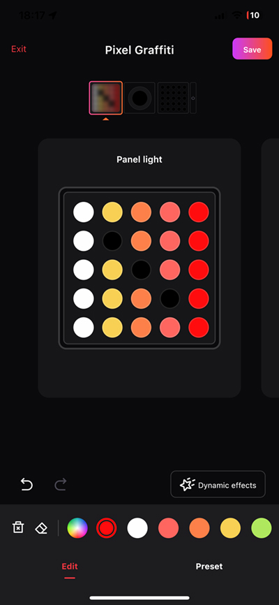
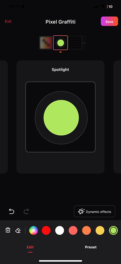
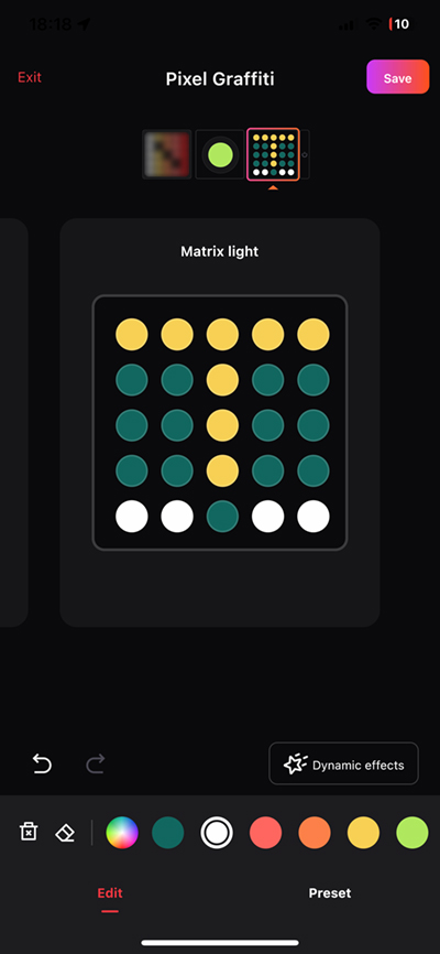
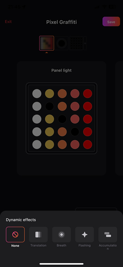
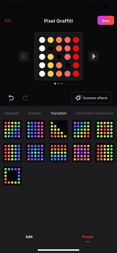
Even though the Cubes come with some nice preset modes, you can create your own, so in the case of both the Panel and Matrix, you can draw your designs on a 25-dot artboard, with each dot representing a colour LED in both of these Cubes. The UI allows you to colour each ‘dot’ individually, which you can see easily reflected on the display for the Matrix, although less so on the Panel, as it has a diffuser, so the dots are far less obvious. The Spot is a different story, as it can only do one colour at a time, so it’s really just a case of selecting a colour. There’s also a ‘Dynamic Effects’ option that can be applied to both preset modes and your own creations. These are;
- None (off basically)
- Translation – scrolling from the top, bottom, left, or right
- Breath – the brightness of the Cubes pulsates slowly
- Flashing – the cubes turn on and off
- Accumulation – the design is gradually built up with the relevant LEDs turning on bit by bit
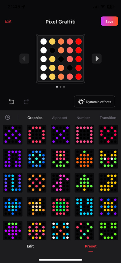
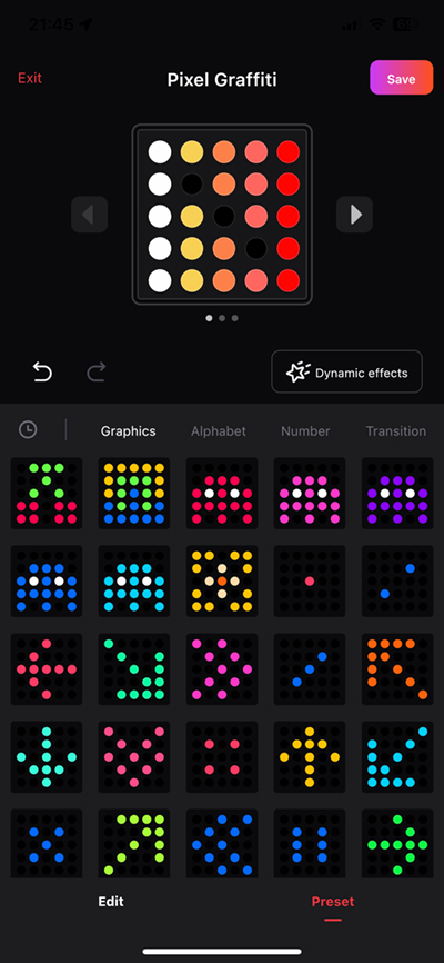
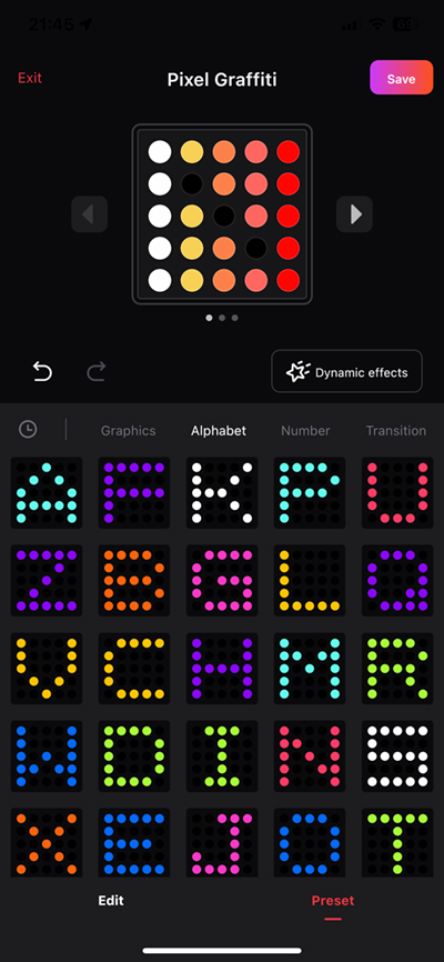
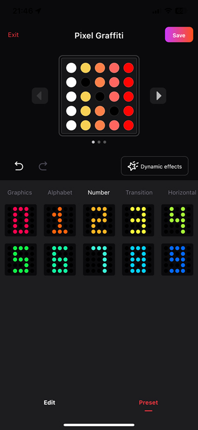
In addition to the option to create your own visuals, you get a large selection of presets that are grouped into different areas;
- Graphics – these consist of icons of all types, like arrows, patterns, hearts, and even those ghost creatures found in Pacman
- Alphabet – this is simply the 26 letters of the English alphabet
- Numbers – zero to nine basically.
These all come with preset colours, although the colours can be changed simply by selecting the ‘edit’ button at the bottom.
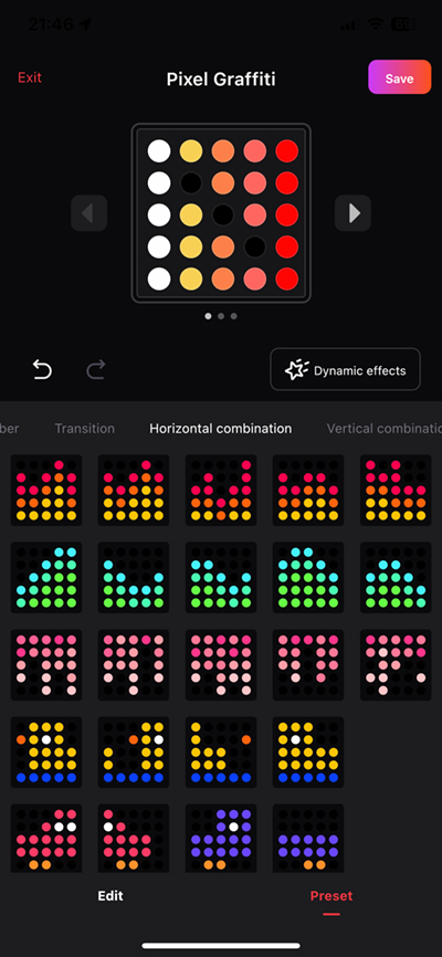
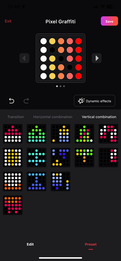
And finally, you get some presets designed to work best with certain dynamic effects;
- Transition
- Horizontal combination
- Vertical combination
These allow you to set up a set of Cubes (using only Matrix Cubes for the best effect) and have them move in sequence to create a sort of animated effect, as the designs roll either vertically or horizontally across all of the Cubes.
CLOCK FUNCTION
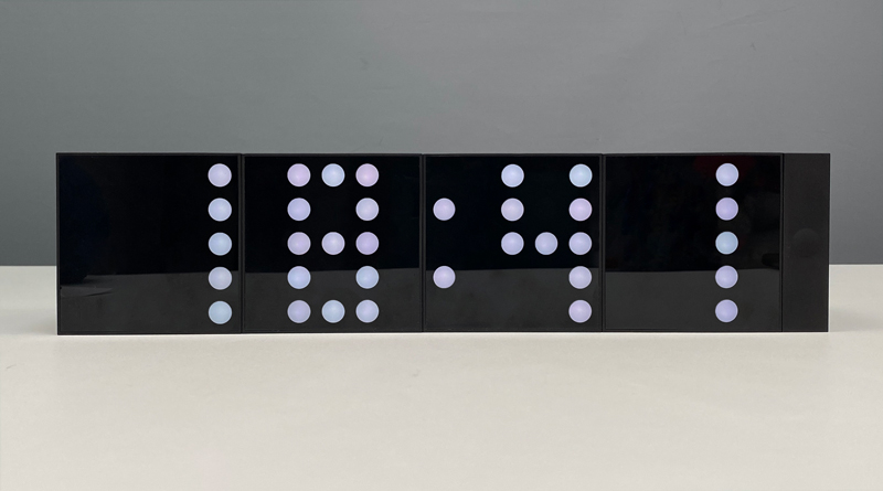
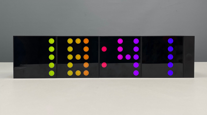
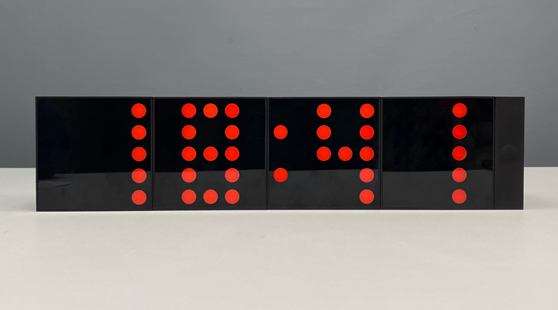
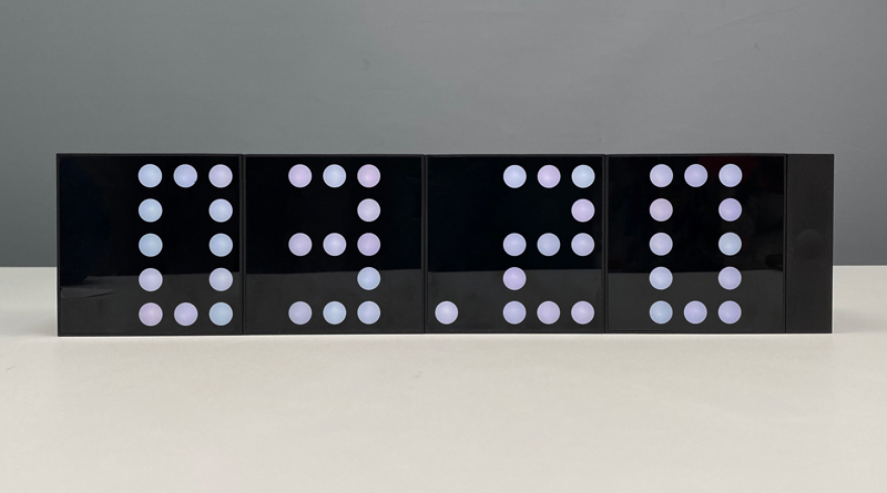
Many people asked me on social media if the clock feature would actually work once these were released, and I’m happy to say it works as hoped.
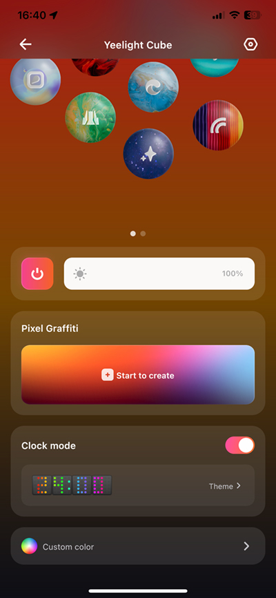
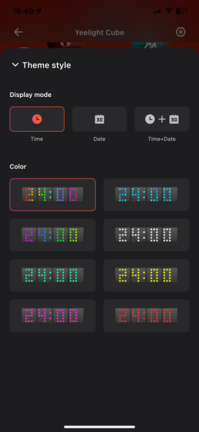
There’s nothing you need to do other than to turn the feature on in the Yeelight Station app, although to be clear, this feature cannot be activated unless you have at least four Matrix cubes available and set up in the app. Once that’s sorted, you can then just turn the option on and the current time will immediately take over from whatever was there previously. Tapping on the clock theme opens up a second screen that offers a choice of 8 preset colour options, ranging from multi-coloured, tinted, or regular colours. These cannot be altered, other than for brightness, so if you don’t particularly like the choice of yellow in the particular preset, that’s too bad.
You also have the option to choose from just the time, the date, or both date and time. The latter option switches between time and date every few seconds. If you add other Matrix or Panel Cubes to the lineup whilst the clock is active, they won’t do anything and will be inactive. The Spot is the exception to this and will beam a solid colour in the same hue as the clock, and at the same brightness.
IN THE HOME APP
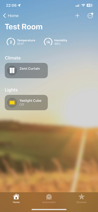
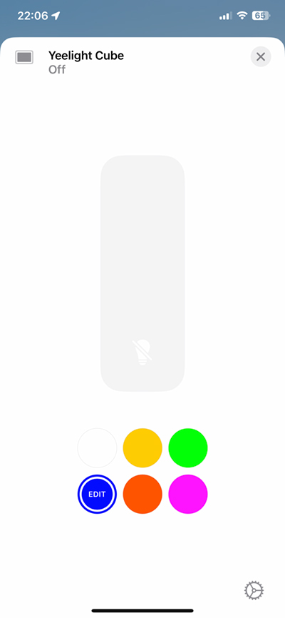
If you’ve ever owned any multicolour devices before (like the Onvis K1 Kameleon light strip for example), you’ll know that HomeKit is confined to one colour at a time, so if you choose a colour in the Home app UI, all the cubes will change to this colour. Any special designs will also be replaced by a solid colour, whether it’s the Panel, Matrix, or Spot. You can adjust the brightness as normal, and in fact, if the Cubes are set to a specific Yeelight Station ‘Mode’, turning the cubes on within Home will retain that design, and even allow you to adjust the overall brightness of that design, but the moment you choose a colour, the design is gone. Companies like the aforementioned Onvis get around this by allowing you to create multicolour designs in their own app and save them as ‘Scenes’ which also show up as scenes in the Home app, thereby allowing you to recall these multicolour creations within automations etc. Yeelight’s app is not currently capable of such a feat, at least not right now, which is a shame.
This points to the larger limitations of the Yeelight Station app, as you don’t even have options to trigger the cubes to turn on or off via schedules. Even if the app was only capable of turning a design on or off at specific times or days, it would be something, but it can’t do anything like that, which means a lot of these changes have to be performed manually, via the app or the button on the base unit.
Hopefully, based on my conversations with Yeelight so far, this will change with future updates to the app, that’ll add more functionality, and likely even more ‘Themes’, so we’ll have to wait and see. It’s also entirely possible that even more types of Cube will be released down the line, although what form these would take I’m not sure.
MATTER
When it comes to Matter, things worked fine when it came to adding the base unit to HomeKit, and it was pretty much like adding any natively HomeKit-compatible device. That said, when it came to adding it to other platforms, it was – as you’ve probably seen is the case with some other reviewers – a bit of a mixed bag. I currently have devices from Google, Amazon, and Samsung* that will all allow Matter over WiFi devices, although in the case of the former two, you can currently only add a Matter device via their respective Android apps. This was a success when it came to Alexa, and I am now able to control the Cube lights via Alexa or the app – even on iOS now that it has been added to my account. Sadly it wasn’t the case when it came to Google, for whatever reason, but I’m not going to dwell on it for now.
*I have yet to set up the Samsung SmartThing Station…lazy
IN USE
I’ve had a fair bit of fun exploring the options available, and generally speaking, I think Yeelight has scored a large win with this set of lights. The obvious comparison to the recently released Twinkly Squares can’t be ignored, although they are in many ways quite different products – the Twinkly offering is designed for being wall mounted, whilst these Cubes are meant for a desktop or shelf. The Twinkly Squares do offer a higher ‘resolution’ if you can call it that, as they offer an 8 x 8 matrix, which gives you a total of 64 individually controllable LEDs compared to Yeelight’s 5 x 5 matrix (25 LEDs), but importantly, Yeelight offers three different models, not just a matrix-type tile. Both use WiFi, but if you were ever concerned about futureproofing, then Yeelight, with its Matter support offers local control for all compatible platforms. Both offer Razer connectivity, and even though I don’t have a PC, for any gamer out there, these would undoubtedly be a welcome addition – not just for gaming, but music and video too.
The build quality is in all honesty, second to none. The cubes are really well manufactured, and just by holding one in your hand, it just feels really premium. Likewise, the colours are richly saturated and bright to the extent they need to be, and as it uses WiFi, you generally get fast response times, although I’d really have liked to have seen Thread in use here.
My only frustration is the lack of any form of automation or scheduling options within the Yeelight app, so I do hope they come up with something in this respect, even if it’s basic, as without this, it can be tiresome to go into the app or get up to turn the Cubes on or off.
Some have said they don’t see the point of these, and whilst I get the argument, I think as I’ve already said, these work best when paired with a PC, but I think there’s a lot of mileage still to be had with these. Sure, it’s a bit of a novelty in many ways, but then I’m not Amish, so I think I can afford to experience some colourful smart lights once in a while without the need to question its role in society!
If you’re looking for functional lighting, these are almost definitely not for you, but if you have kids, like to entertain, or play games on your PC, these are some of the better products on the market right now.


