Icon changes to HomeKit in iOS13
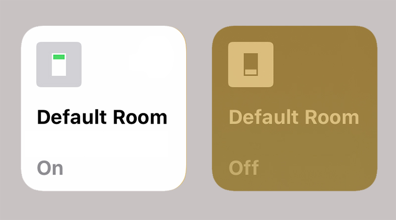
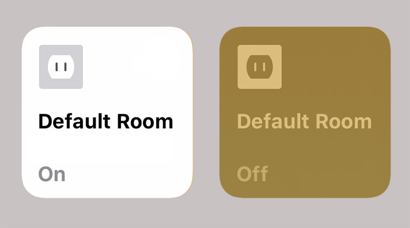
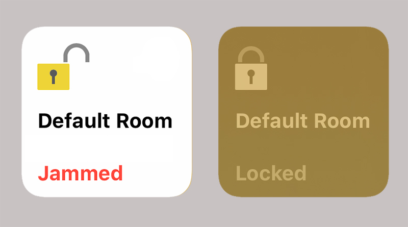
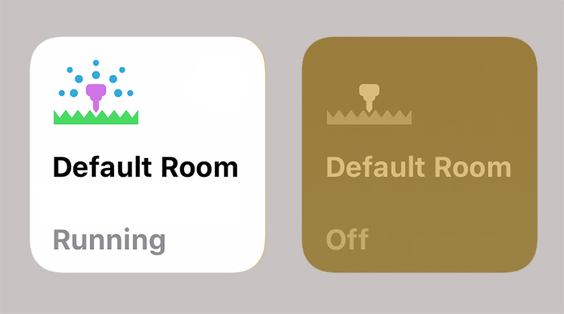
By now it’s true to say a fair bit of the updates and changes to HomeKit has been covered fairly extensively, but it’s always nice to cap things off (until the next set of changes), with a run through of the icons that have been updated – or not in some cases – in iOS13 in the Apple Home app.
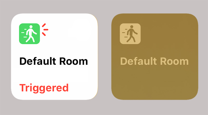
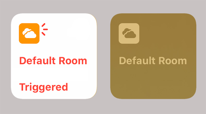
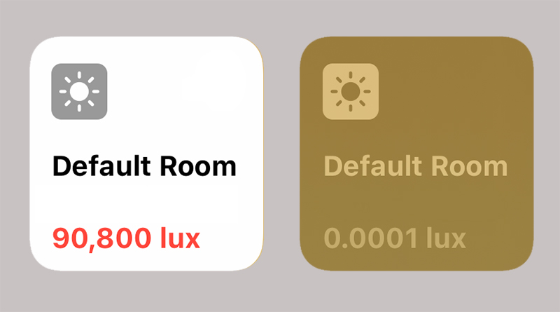
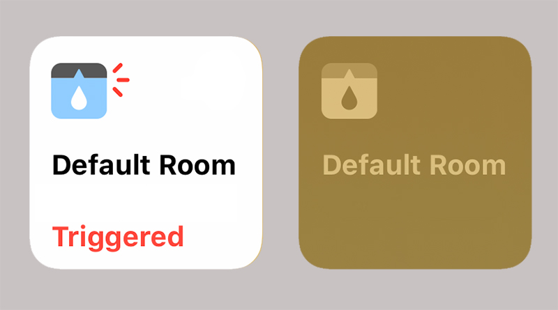
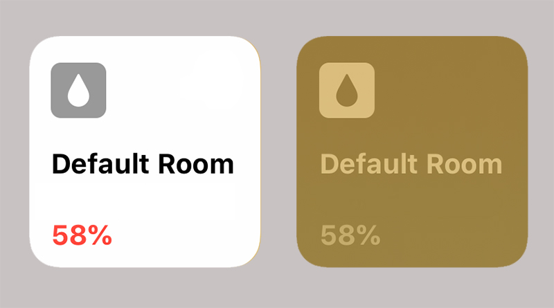
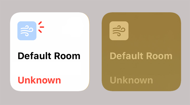
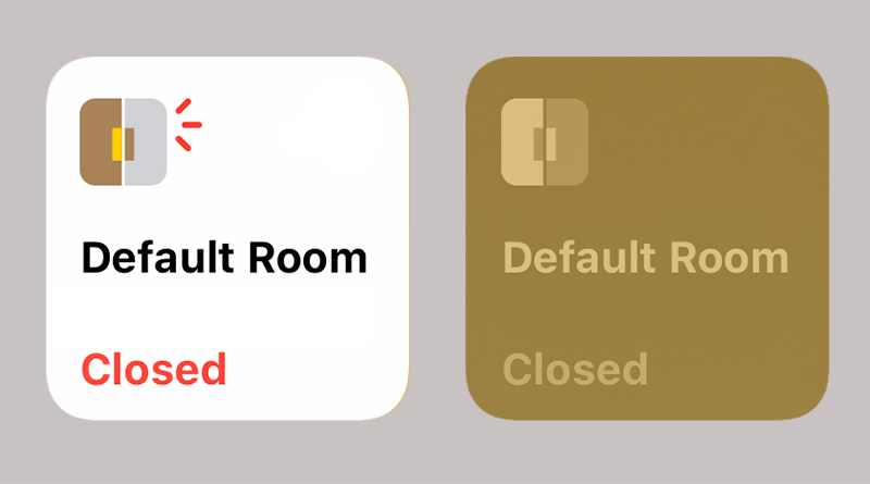
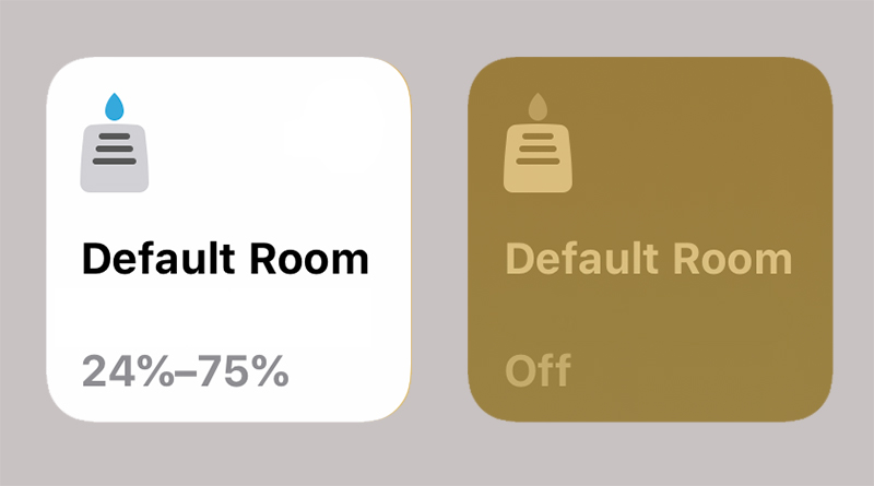
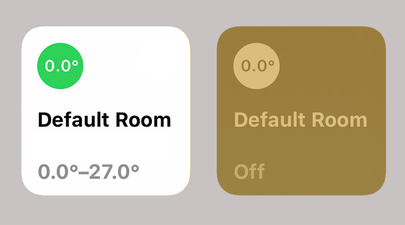
When it comes to changes, the only ones that have really been updated are the sensors. Currently, in iOS12, all of the different types of sensors (excluding temperature sensors) were bundled together with the use of just one icon, but in iOS13, each sensor has its own icon;
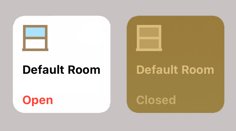
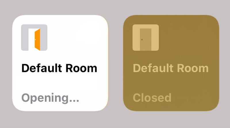
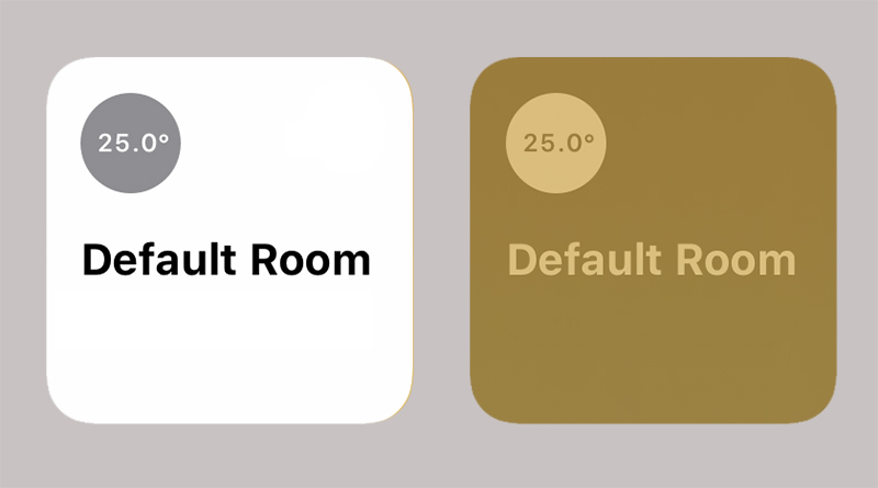
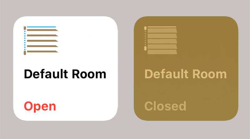
Other icons have stayed much the same, however, although in some cases colour has been added or tweaked;
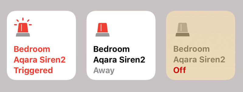
The alarm/security section, which for the most part belongs to the Aqara hub at this point, has not changed, although rumours are that additional functionality will be coming that will allow the alarm to be set for only certain sensors, so one option would be to set the alarm to be active whilst the home is occupied. This would allow external door sensors to be activated for triggering purposes, but not motion sensors, for example. At present, the alarm states simply show ‘off’, ‘away’ or ‘Triggered’, with ‘Away’ being the setting for when no one is in the house, and thereby all relevant sensors (motion for example) would be included as triggers).
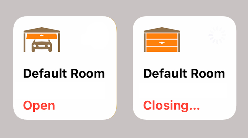
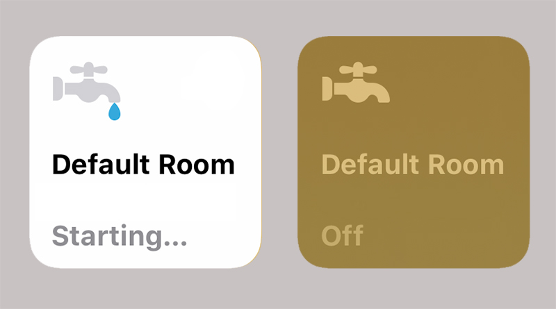
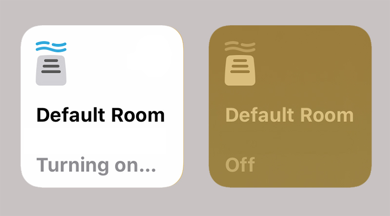
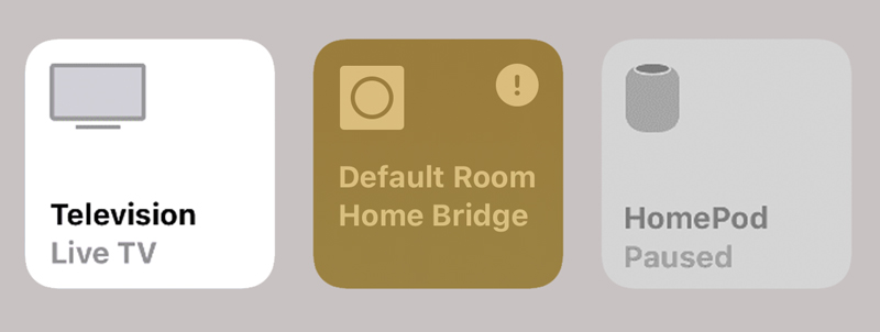
Other icons have been kept as they are, but we’re including them here for the sake of completeness, or as close to completeness as possible*.
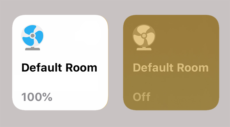
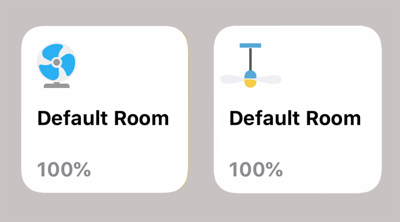
The last icon in the group above – the fan icon – can be used in place of an outlet, but interestingly this icon also can show percentages from 1-100%, so this would also be used for HomeKit enabled standing fans. There’s also a new fan icon to represent ceiling fans;
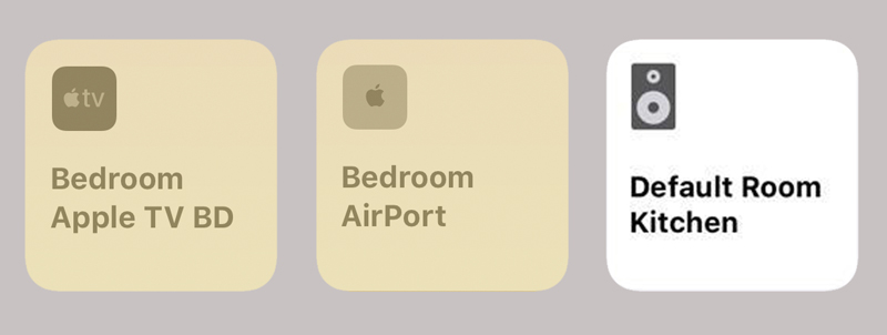
As for airplay 2 devices, we have Apple TV, Airport Express and an icon for Airplay 2 enabled speakers. This can also include TVs that will also have HomeKit functionality or TVs that only have with Airplay 2, like the Samsung models.
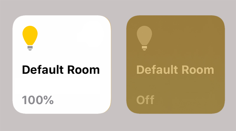
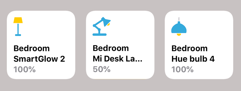
Finally, the light/lamp icons that are available besides the default bulb icon, and on that note, I think we can all agree we need more!
Thanks to 葉秉豐 for providing most of the screencaps.
* If we’ve missed an icon, which I’m sure we have, let us know!



Hello,
I totally agree, we would need more lamp icons !
Also I would like more Scenes icons (are there any new ?)… and maybe change the background color like in shortcuts…
No new scene icons at present unfortunately. Maybe this will be added at the last minute before the release the final version, but I don’t think they will…
Are there any normal sized desk fans that work with homekit yet? I’ve heard dyson do one, but I was hoping for something a little cheaper.
None that I’m aware of yet, although if you wanted to control it by voice, you could get one that works with the Mi Home app and control it via Siri Shortcuts. That’s how I Currently control all aspects of my Mijia Standing fans.
Pingback: Обновление иконок Homekit в iOS13 | inDaHomeKit
Can we get vector files of these?
Unlikely, but they wouldn’t be hard to reproduce if you know your way around Adobe Illustrator.
I in fact do .. but I’d rather have the original outlines. I’ve been thinking of coming up with a homebridge config-ui-x theme that follows the home.app design closely.
Agreed. It’s never quite the same sometimes without the original files. I like the sound of your idea.
Looks like even more icons are coming down the pipe:
https://9to5mac.com/2019/08/19/macos-home-app/
Yes, there are actually even more than in that article. A total of 5 window icons, 4 contact sensor icons, a new icon for smart door locks, and even a power strip icon.