Vocolinc L1 Smart Colour Bulb (review)
As with smart plugs, smart bulbs are definitely up there in terms of a popular item, but unlike smart plugs, there are a few more variables to choose from; You can get basic white bulbs from the likes of Philips Hue and LiFX, and Tuneable white bulbs that give the range of warm too cool white light, depending on your preference and the time of day. Then you have colour bulbs, all of which give you the typical 16 million shades of colour. But it doesn’t stop there. You then have a variety of bulbs with different brightness levels, typically ranging from 400-1000 lumens. Today’s review of the Vocolinc L1 Smart Colour Light Bulb falls into this last category, being that it’s colour (the clue is in the name).
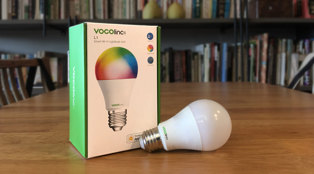
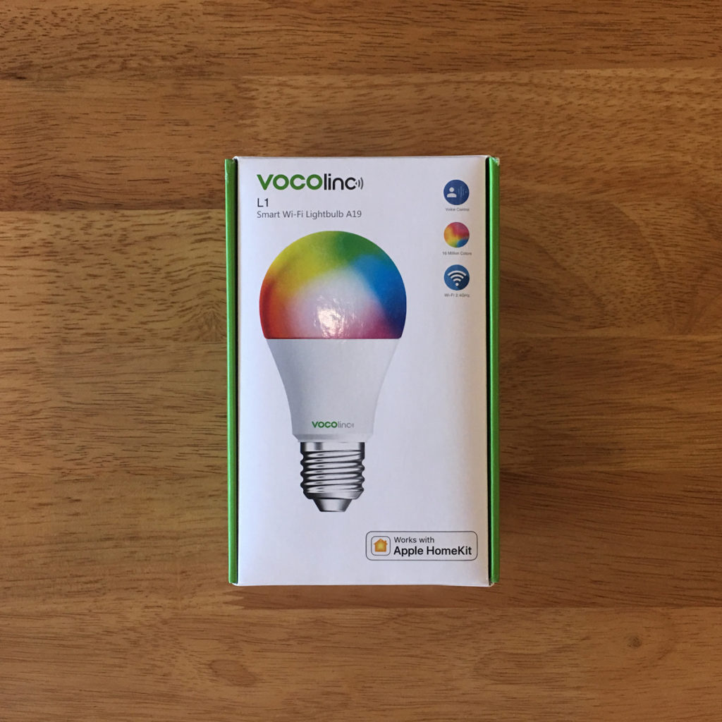
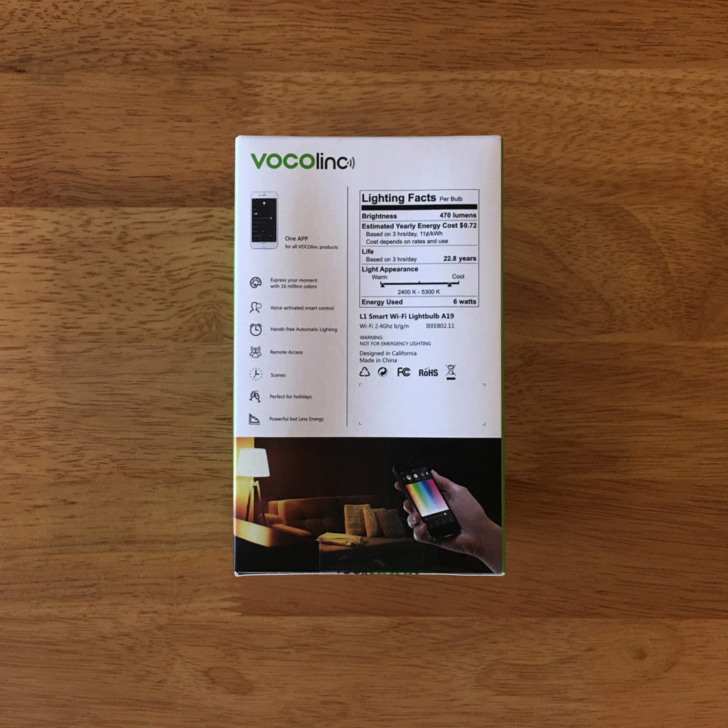
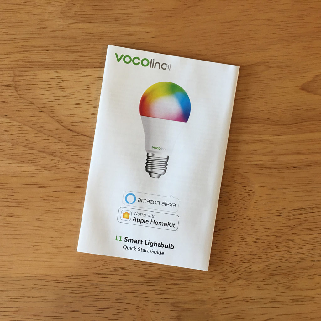
Packaging doesn’t need to be just functional, and if you know anything about marketing, you’ll know that packaging can either make or break a product. Good packaging like the one we have here, gives the customer everything they need without having to guess what it looks like or figure out if it’s compatible with their system. So, on the front is an image displaying the colour bulb – admittedly, the bulb doesn’t look like this when it’s turned on, but this seems to be the only way to let people know that it can produce many, many colours. Call it ‘artistic licence’, but there it is, the product, showing a colour bulb, with an E26/E27 base, info on what it can do and the all important ‘Works with HomeKit’ banner on the bottom. That alone is enough to sell it to most people, but there is a lot more to tell, if you’ve been enticed enough to pick it up, with the back displaying specs and features for those that want more. Aside from looking informative, it’s uncluttered and direct, but most of all it’s a solid enough box, and if anything needs protection, it’s bulbs, even though we tend to have plastic instead of glass these days.
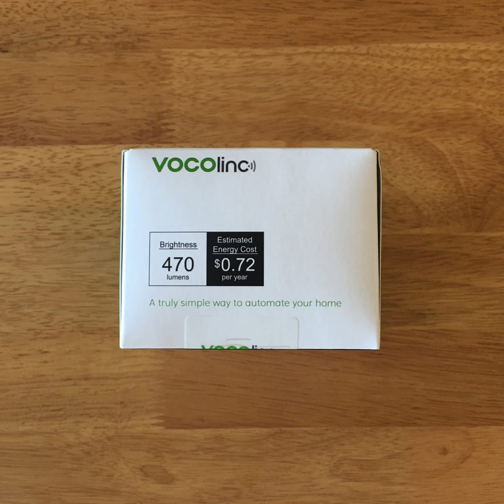
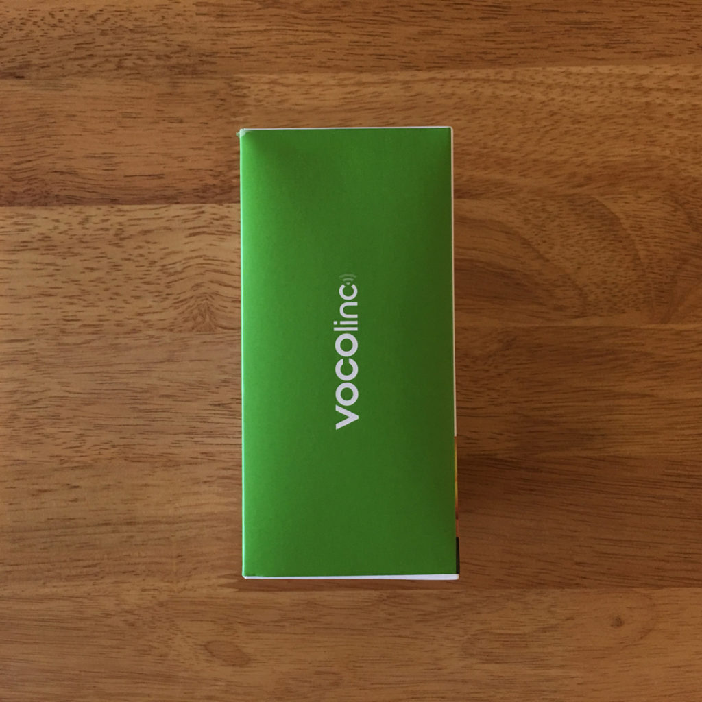
Wrapping up the outer packaging side of things, we simply have the top displaying the lumens, or brightness of the bulb, along with the typical cost of running a bulb of this type. The side of the box simply displays the Vocolinc logo and the distinctive green colour they use on all their packaging. The base is just a lot of legal and copyright information, along with info on downloading the official app by Vocolinc, called LinkWise, for both Android and iOS – yes, this works with Google Home and Amazon Alexa too.
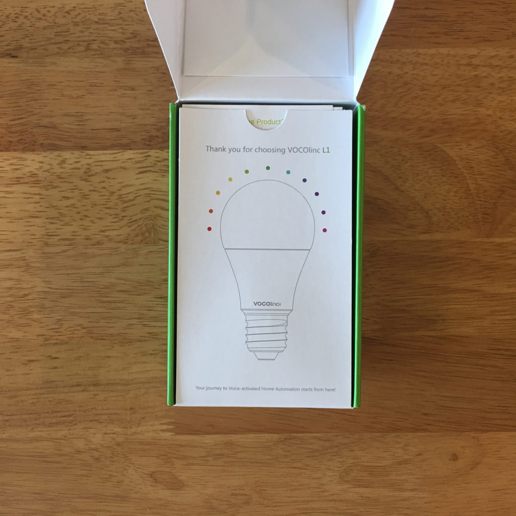
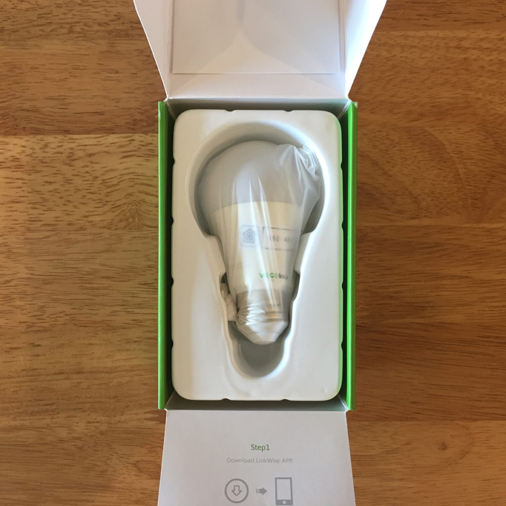
The inside of the box doesn’t skimp on the design side either, with a little ‘thank you’ graphic protecting the bulb further, along with a little holder for the instruction manual with the first of three HomeKit codes stuck to the inside of the lid. This is consistent across the Vocolinc line of products, so it’s nice to know what to expect when you already have one of their products. After finally opening the box, we have the bulb, with more basic instructions on the underside of the inner lid, and the bulb itself wrapped in a latex bag. The bulb is securely held in place, so there’s plenty of protection here.
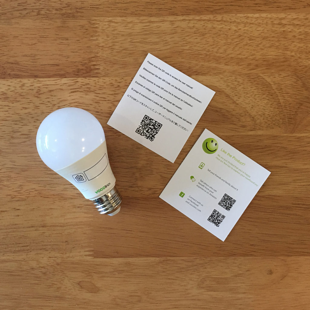
Along with the bulb, which also has HomeKit code #2, we have a couple of welcome and customer service cards, that also help you download the Vocolinc app. The included manual is inside, should you need it, which contains the 3rd and final HomeKit code. The manual itself is only in English., but given how easy it is to set up these bulbs, you probably wont need it anyway.
Onto the bulb itself, first off lets give you some basic specs;
- It’s a full colour bulb, capable of 16 millions shades of colour
- the brightness is 470lm
- AC120v, 60Hz **
- compatible with HomeKit, with no hub needed*
- Also compatible with Amazon Alexa and Google Assistant
- Use 2.4gHz Wifi for communication, not Bluetooth
** The product I’m reviewing here, is the US version, so it’s suitable for US systems – 110-120v AC / 60Hz, although there is also a version available for countries that use the 220-240v / 50Hz system.
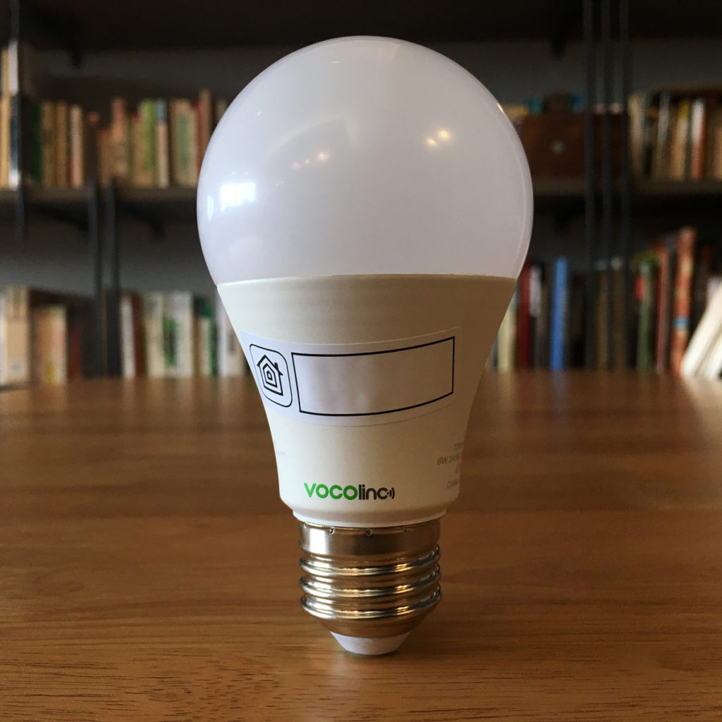
The bulb comes with the HomeKit code on the side, so there’s little danger of losing it, although I would advise making a note of the code, or better still check out Aaron Pearce’s excellent HomePass app to store all your codes in a very tidy manner. The shape of the bulb itself is fairly standard and certainly doesn’t look out-of-place if you were to use it in recessed lighting where the bulb is visible. The total height of the bulb is around 105mm from top to bottom, so this should easily fit into almost any space.
Now I do own a few other bulbs, some of which are colour, and some of which are tuneable white and basic white, so although I’m no expert, I would say I have some experience of bulbs as such, and how they can differ from one brand to the next. Now the relatively low lumen levels on this bulb do need to be pointed out, especially when compared to the ubiquitous Philips Hue bulbs, the equivalent of which would be the White and Colour Ambiance Bulb, which clocks in at 800lm. The Philips Hue is another extra $15.00 though, so the question I’d have to posit is, do you need that many Lumens? It depends; if you intend to use the white light functionality of a colour bulb, it may well be necessary, but for me at least, I buy a colour bulb mainly for its colour capabilities, and when it comes to colour lighting, I regard it as mood lighting, or accent lighting, and there really isn’t a need for my colour lights to be that bright. This is just me though, so if you want very bright red, green or even Cerulean blue (!), then by all means go for something brighter.
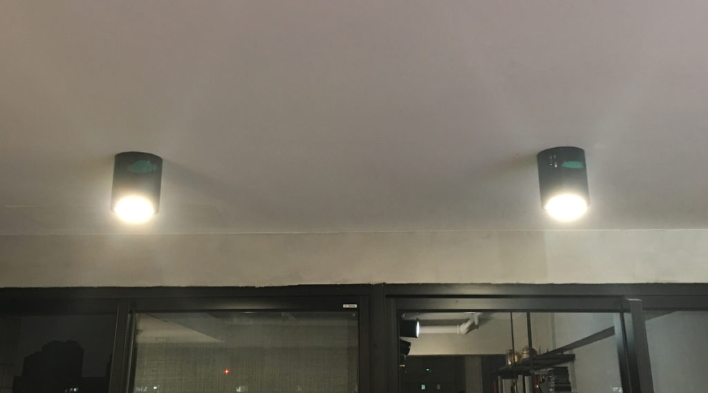
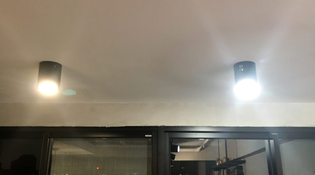
I’ve come to expect things to be straightforward with Vocolinc and other HomeKit products, so installation was a breeze, with the use of the HomeKit code method, so getting the bulb up and running took about two minutes, if that. As soon as I was able to install it, I checked the brightness levels compared to another standard LED bulb that was already seated in one of the light fittings. It would seem that when you first install a Vocolinc bulb, the default brightness is set to 50%, so I took the picture above to demonstrate the brightness levels compared to a similarly powered bulb – the bulb on your left as you look at the image is a standard LED bulb with 425lm, while the one on the right is the Vocolinc L1, but at only 50%, so you can see, there’s obviously a lot more brightness to be had at 100%, which I demonstrate as best as I can in the image below;
Take these observations as simple, unscientific tests, as there are more accurate ways to test lights and brightness, but as I found in a previous review for the Vocolinc L2 Tuneable White Bulbs, there’s a lot more brightness to these bulbs than the number on the box would have you think. The cool whites on this bulb were just right, with only a hint of blue, so more ‘icy white’ than anything else, whilst the warm white was actually verging on Orange, which some may welcome, although for me personally I tend to pull back a bit on the ‘warm white’, which is really the great thing about all decent smart bulbs – you choose the brightness, the warmth and the colour as much as you like.
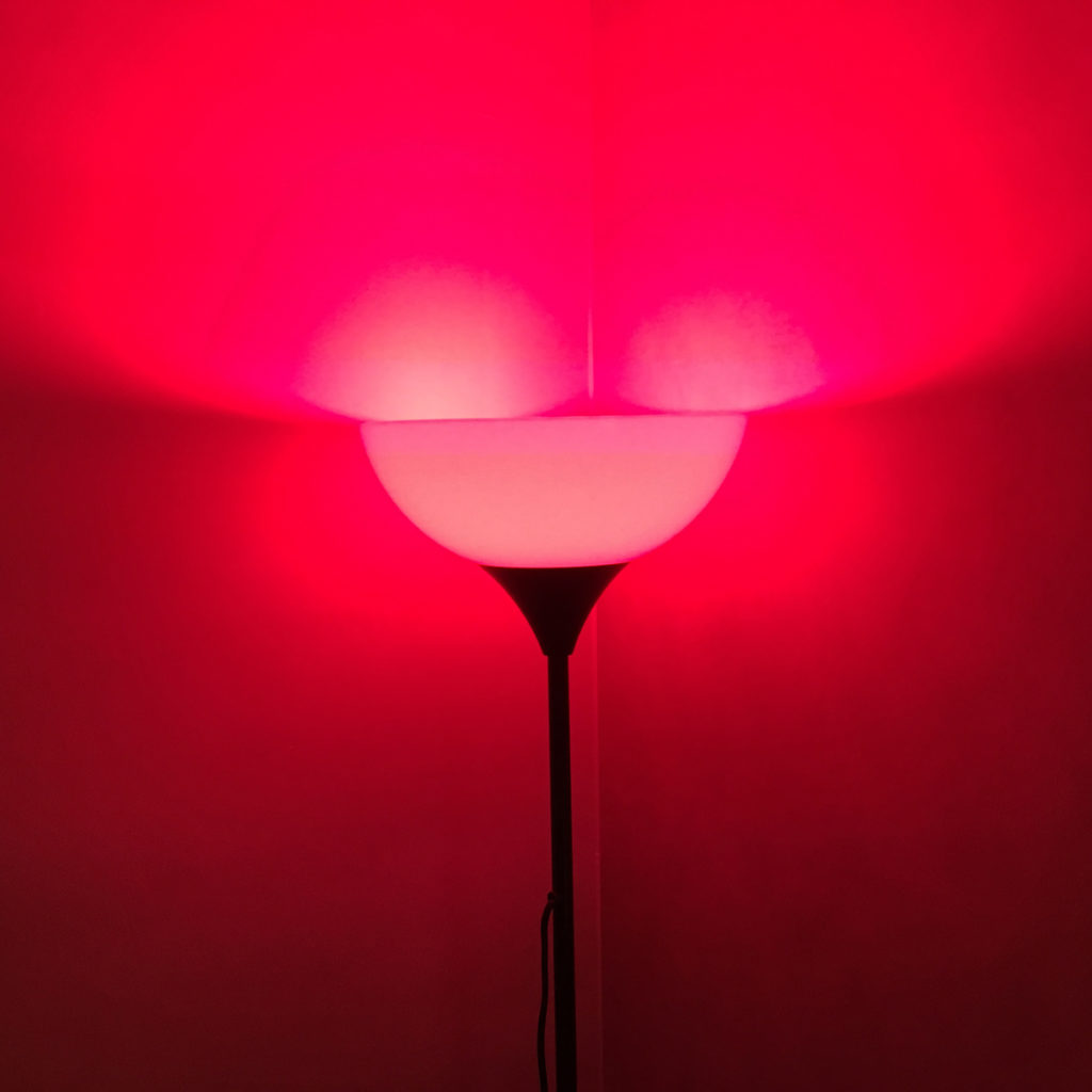
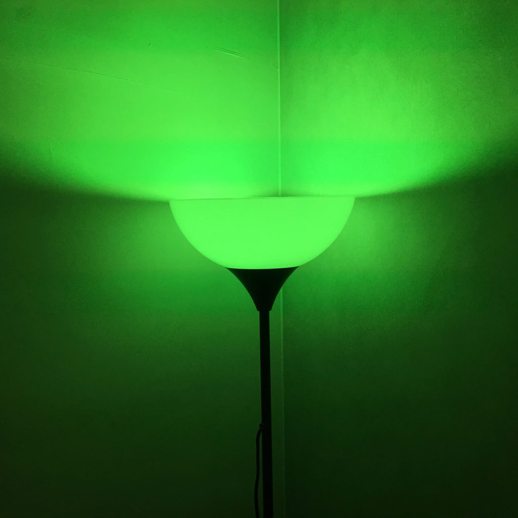
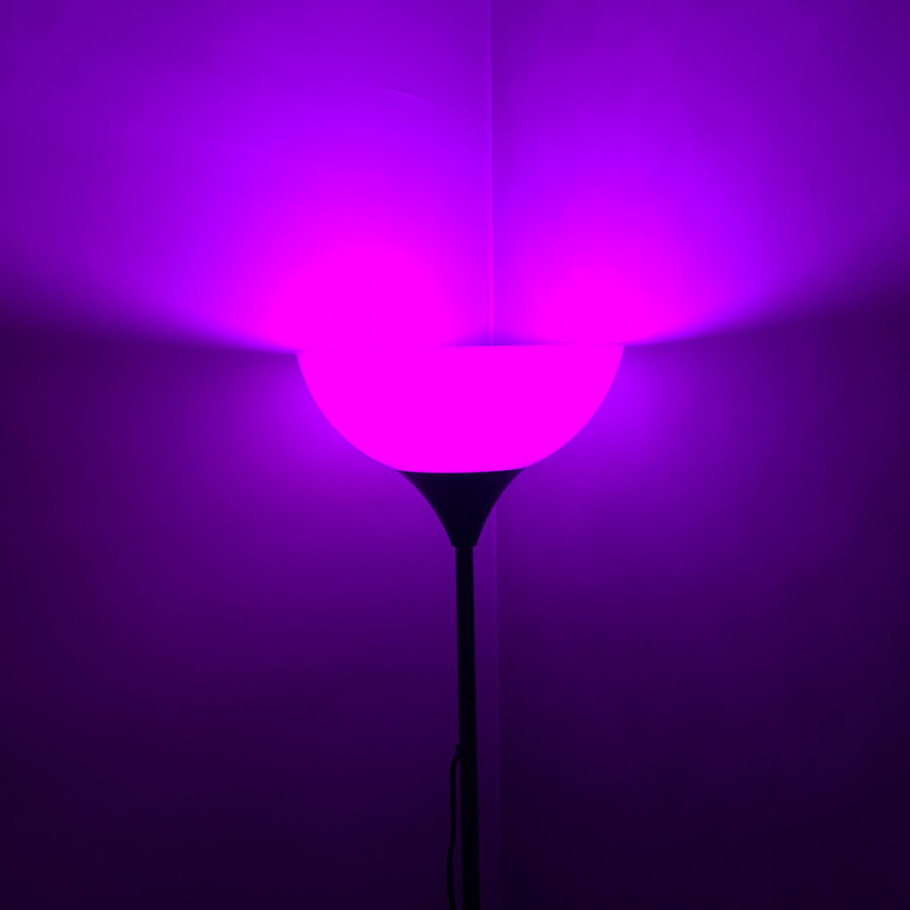
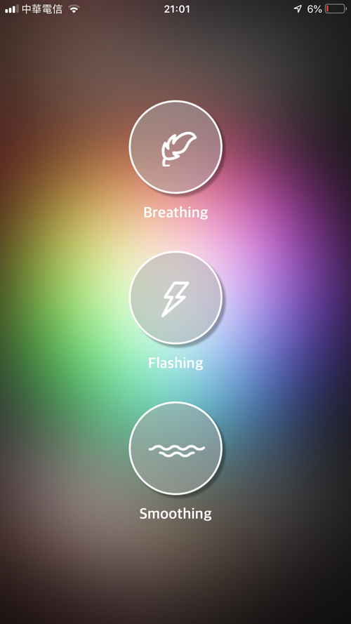
The Home app displays the bulb as it would any light, with options for brightness, temperature and colour, so there’s nothing out of the ordinary there. However, if you choose to use the official Vocolinc app (LinkWise) then you do get additional options, like ‘Breathing’, ‘Flashing’ and ‘Smoothing’. The ‘breathing’ option displays a basic colour before fading to off, then fading back up to your desired brightness with a new colour before repeating the process again. The ‘flashing’ option, is basically the same, except instead of fading in and out, merely goes on and off in succession, with a different colour each time. The final option, ‘smoothing’ does the same again, but instead of going to zero brightness, transitions from one colour to the next. Of the three, I prefer this one the most, as it’s the least distracting and as the name implies, it’s smooth. There are a couple of options available to all three of these transitions, namely the choice of colours the light transitions through, so if you don’t like blue, you can replace it with something else. The interval between transitions can be adjusted too, so you can really let the colours blend in a very calm and slow manner. Finally, you can choose the overall brightness of the bulb while performing these transitions. These may be considered party tricks, but it’s nice to have this option for when you do have a ‘party’.
I have to say, that whilst a lot of bulbs are fairly similar, and these are not any different in this respect, you do seemingly get a lot of brightness for such low lumens, and considering the price point and the fact you don’t need a hub*, I’d say these are easily worth having a look at, unless you really do want those extra lumens. I for one don’t, so I’ll be placing more of these in strategic locations of our new apartment very soon.
* you don’t need a dedicated hub for the L1 Smart bulb to work, but you would need an Apple hub (iPad, Apple TV or HomePod) for automations, timers and remote access.
Note: Vocolinc provided HomeKit News with this L1 Smart Colour Bulb for the purpose of this review. No other compensation was made or requested.




Jesus christ, mention the price already.. You talk about price point in the end and the 15 extra for a Hue light, but don’t mention the price at which these bulbs come. Also try linking some direct links to buy stuff. Worst reviewer ever.
You could be more civil if you’re going to come here and criticise. The reason for not mentioning the price is simply that as these are available in other countries, so the price varies, and sometimes these products go on sale. Finally, if you care to look, there ARE direct links to these products. If you’re using a browser that blocks these ads, then that’s an issue for you to sort out.