Changes and Additions to the Home App in iOS13 Beta [Updated July 3]
Many users have been installing the new iOS 13 beta and are discovering just how massive the change is going to be, and maybe none more so than the Home app. With that in mind, we think it’s a good idea to try and catalogue as many as we can, and update this article whenever anything changes, with each update to the iOS13 beta firmware.
***NEW IN BETA 3***
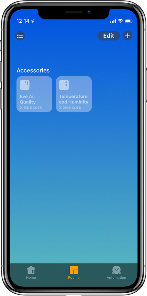
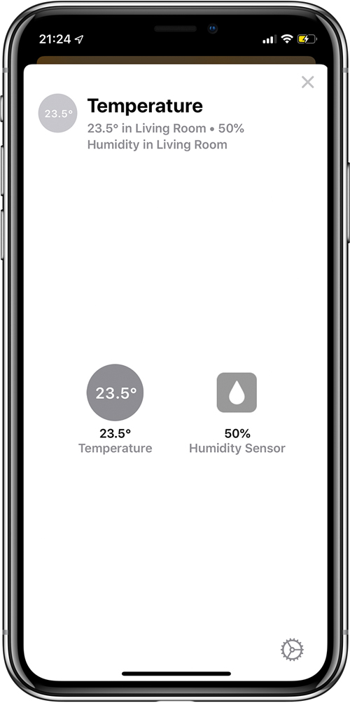
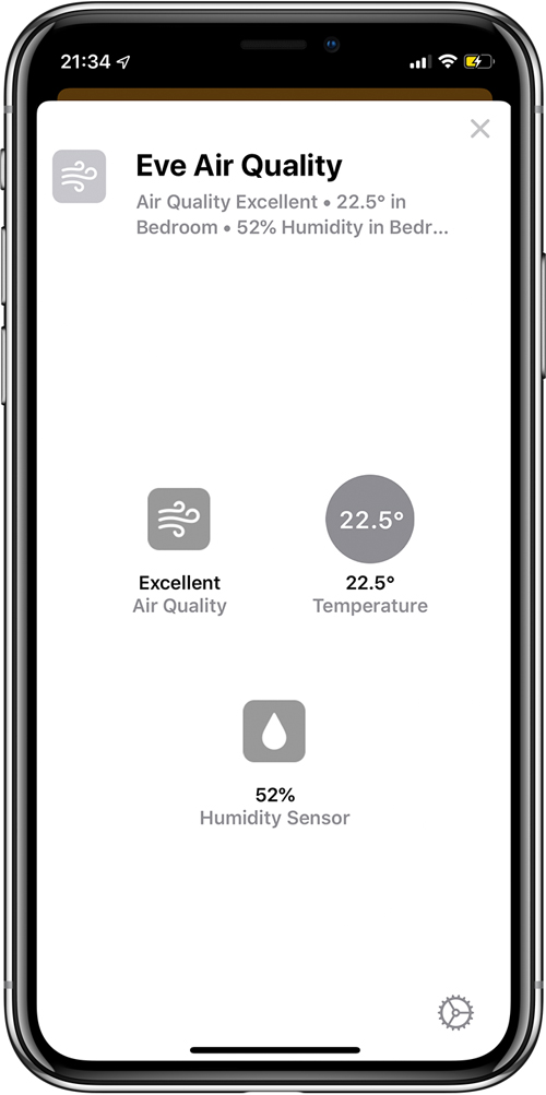
- As you may already know from the first Beta, devices that have more than one ‘service’ built-in, like the Aqara temperature and humidity sensor, have gone from having separate tiles to being grouped into one tile that would only expose the separate services once you pressed on the main tile. With the Beta 3 update, this main tile now displays dots that conform to the number of separate services that the device contains, so in the example above, the Eve Room sensor, which contains sensors for temperature, humidity and air quality/VOCs, shows three dots, one for each service. The Aqara temperature and humidity sensor on the other hand, only shows two dots, one for each of these services (even though the Aqara sensor actually contains an air pressure sensor too, but it isn’t exposed to HomeKit currently).
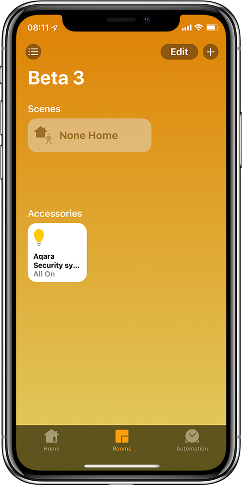
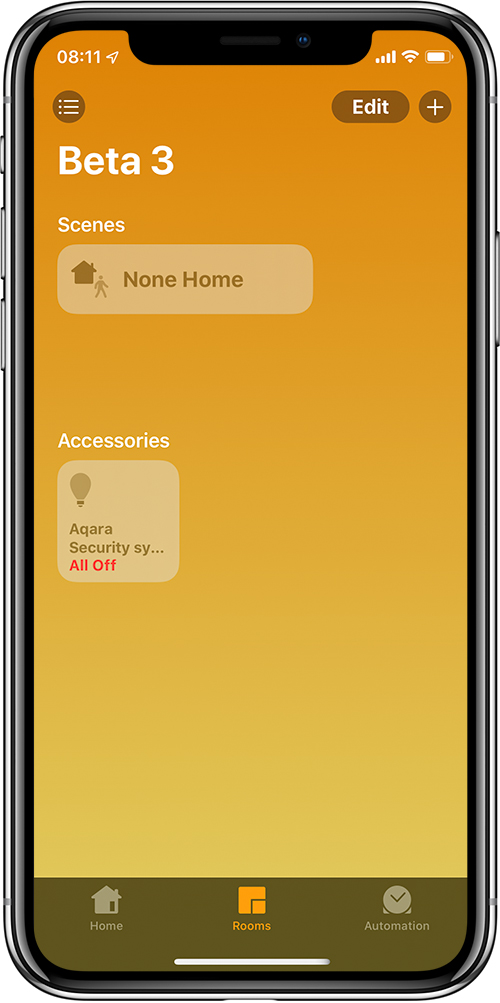
- Another device that contains two services is the Aqara hub, which besides being a ‘hub’, is also an alarm system and a light. Currently in iOS12, the hub, alarm and light are all separate tiles, but now in iOS13, the hub is invisible except for in the settings section of the Home app, as already reported, but additionally, the Aqara alarm and light are combined, but in a different way to the example in the preceding paragraph. With the Aqara gateway, the tile shows up as a light in all instances, but there are four different visual possibilities. In the first example above, you can see the tile with the hub light on at 26% in grey text. This indicates the light is on, and the alarm is armed. The second example shows the light as on, with the ‘26% Brightness’ in red text. This indicates the light is on but the alarm is not armed. The third example shows the light off and ‘away grey text. This indicates that the light is off and the alarm is armed. The fourth and final example shows the light is off, with the ‘all off’ text in red, indicating that the light is off and the alarm is disarmed.
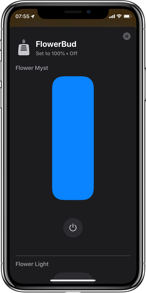
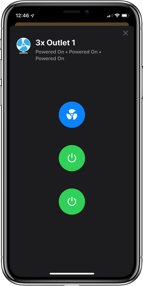
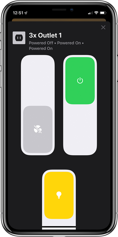
- The previous two betas were missing the names that would be applied to separate devices. For example, in the images above, there’s a Koogeek powerstrip with three separate outlets. Now you can once again add names to each outlet to more easily recognise what is plugged into the respective outlets. This also goes for the second example above, the Flowerbud, which has two distinct devices – a mood light, and a diffuser. These are represented in iOS 13 as a slider for the amount of humidity the diffuser would kick out, along with a slider for the separate mood light, the names for both of which now appear in their respective sections.
Changes to device tiles and how they appear
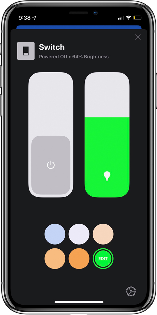
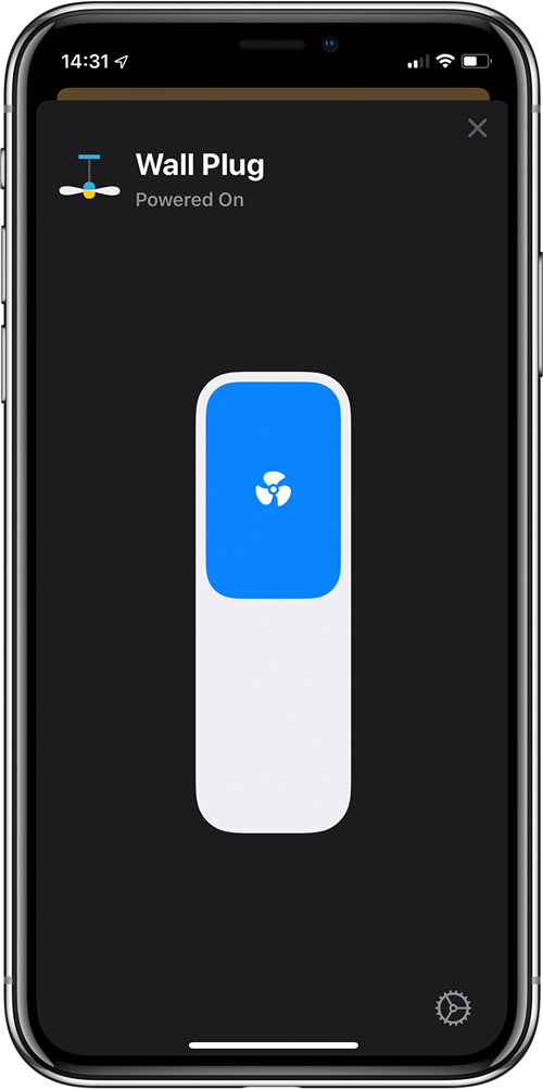
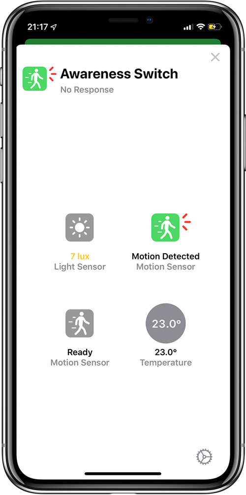
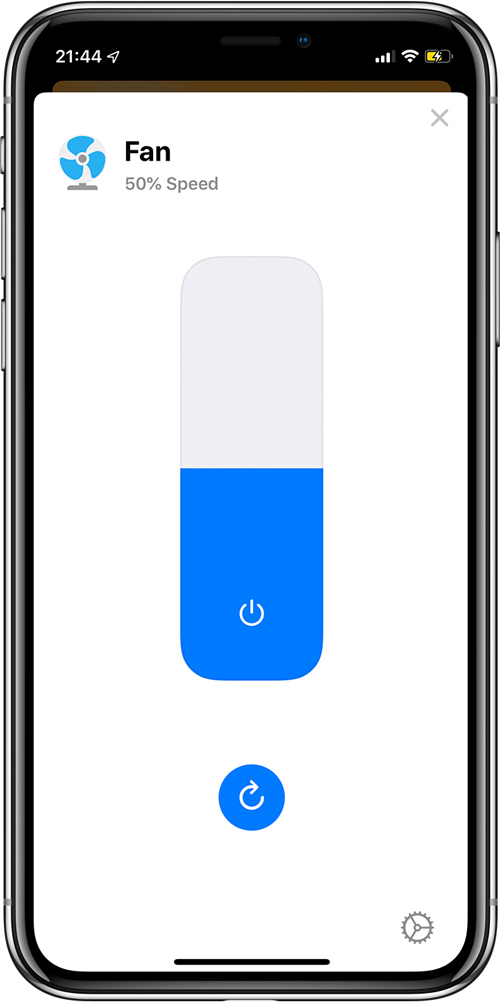
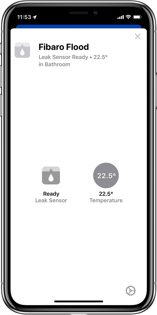
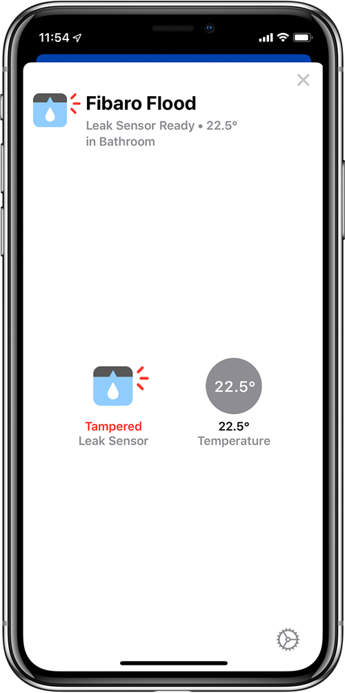
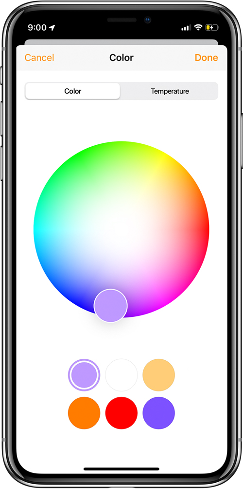
- Devices that provide more than one ‘service’, like the Hue Motion Sensor, which features temperature and ambient light sensor readings, are now grouped together, as opposed to the current state in iOS 12, where each service has a dedicated tile. Similarly, products like power strips will not feature independent tiles for each outlet, instead, being grouped together, with access to the individual outlets, by tapping on the tile for the device, which opens what is apparently referred to as a ‘control card’. It’s worth noting that pressing on an individual tile that only provides one service, like a smart bulb or smart plug, will turn them on or off, as normal. Regarding the outlets themselves, these can still be individually turned on or off, as well as having each outlet assigned as a fan, outlet or lamp. Smart products, like the iDevices Switch (actually a smart plug), that combine a power outlet and an LED night light, are also be combined into one tile but can be accessed as already mentioned, with the LED light and the on/off toggle switch sitting side by side. Additionally, for coloured or tuneable white smart lighting, the brightness slider and six sample colour palettes are both on the same screen now.
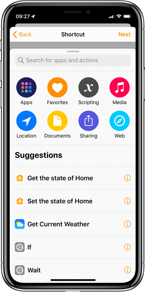
- The video above shows you how, in the Beta 3 update, that you will be able to use a trigger (in this example a sensor detecting motion) to activate a Shortcut from the Shortcuts app. The shortcut here involves turning on an Apple TV and selecting the Netflix app. So, the motion sensor in hallway detects movement, turns on Apple TV and opens the Netflix app.
New and additional icons
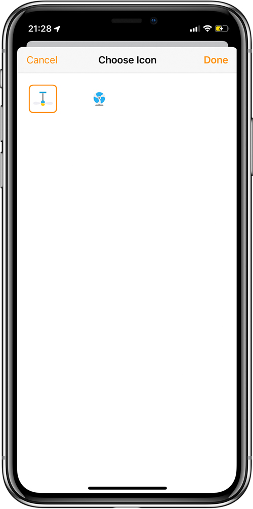
- Although currently there aren’t nearly enough icons for most users, there are a few new additions in iOS13, and hopefully more to be added in future betas. Whilst the choices for a smart plug/outlet currently remain at three (fan, outlet, lamp), the fan has gained an additional icon that shows as a ceiling fan. Additionally, we now have new icons for humidity, ambient light and air quality sensors. The motion sensor gains a new colour when motion is detected. As regards icons for scenes, these have so far not been changed or added to.
HomeKit Cameras and Hubs
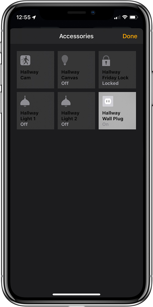
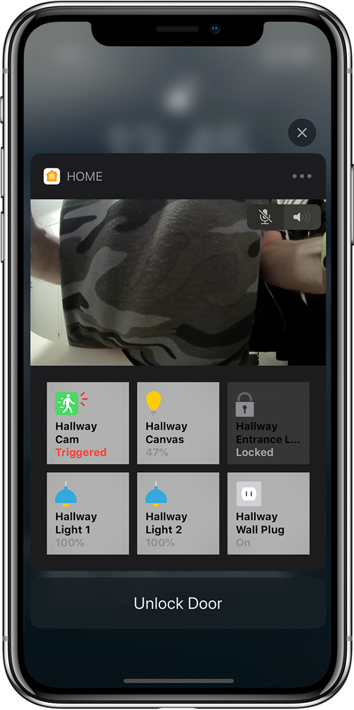
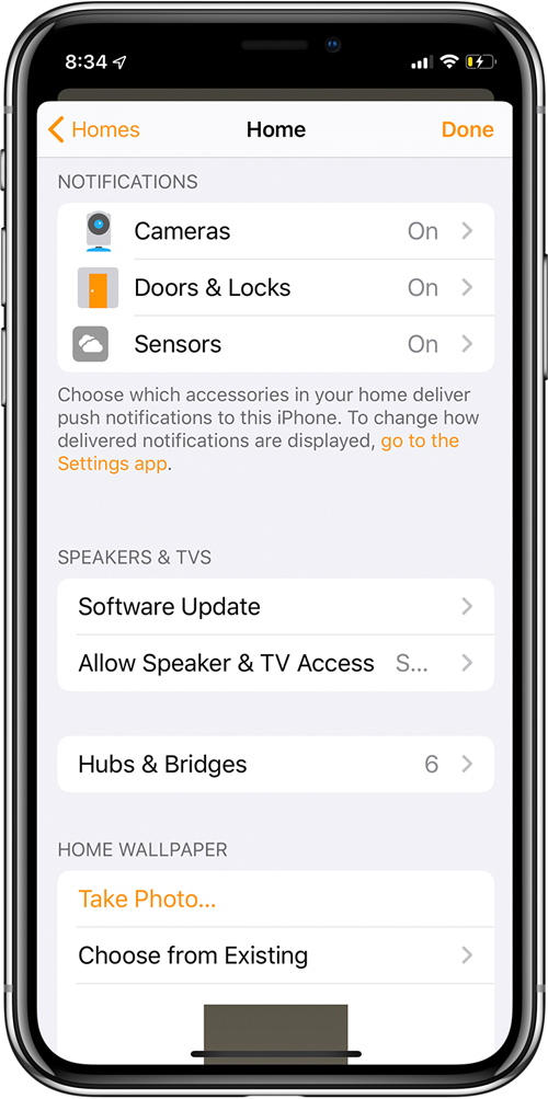
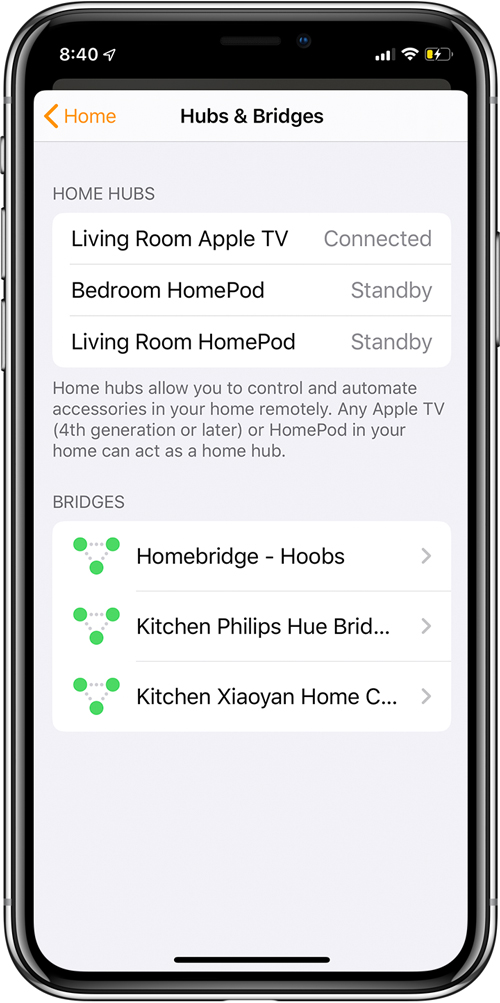
- When viewing your HomeKit camera, there’s now an option to quickly access all the other HomeKit devices in the same room as the camera, by pressing on the small icon in the bottom left corner. Bridges/Hubs have now been removed from the rooms they’re located in, but you can now see all of these if you go into the settings for your ‘home’ (the home icon in the top right of the main screen). The main screen for viewing the live camera feed also has a blue dot. We’re not sure what this means, and whether there will be additional colours to indicate different statuses for the camera, but it’s a new addition, nonetheless. One other big change is when you get notifications from motion sensors that are in the same room as a HomeKit camera; currently, in iOS12, you get a snapshot from the camera with a notification. Now in iOS13, you get a notification AND a live stream from the camera – even on the lock screen. Additionally, within the notification, you can choose to use two-way audio, along with the ability to control any other devices that are in the room, like lights, smart plugs or even a HomeKit door lock.
Lighting and Thermostat settings, and Suggested Automations
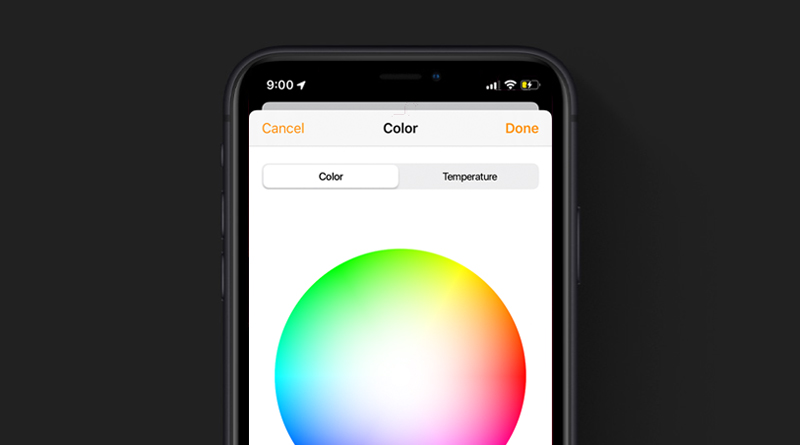
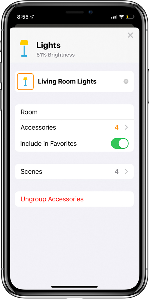
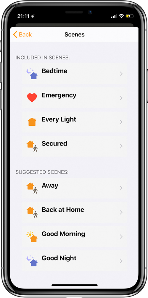
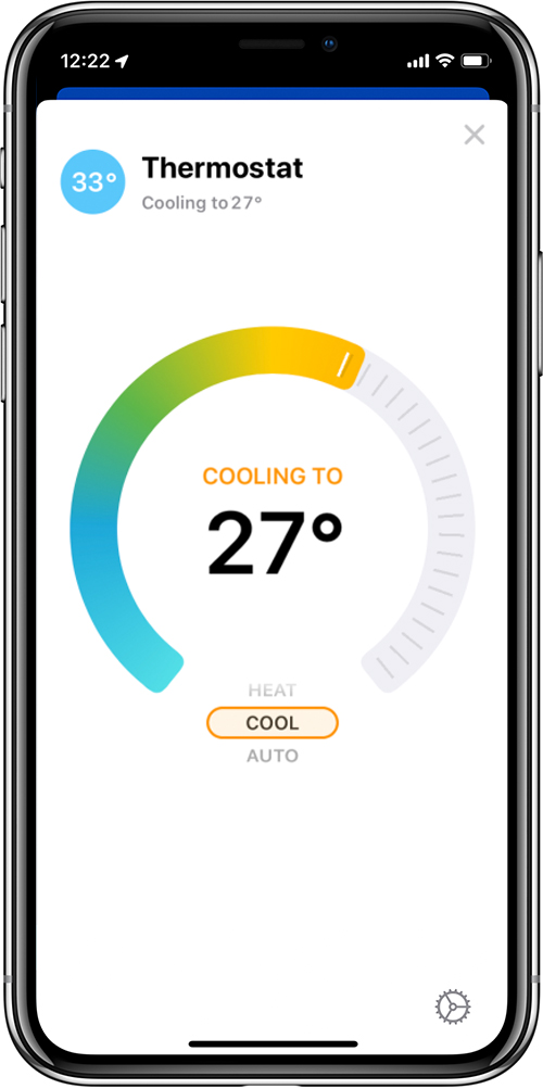
- When you go into the settings for a Device or even devices that are grouped together, like a series of smart bulbs, for example, you now get a new option that shows that they’re included in scenes, as well as being able to see those scenes, as well as an option to include these and other devices in ‘suggested scenes’. This can also apply to any other device, not just lighting. The colour picker has been slightly revamped, so whilst the colour wheel stays, it no longer has a hole in the centre, and the six user-defined, quick access colours are no longer on a separate screen but included on the same screen as the colour wheel. The colour and colour temperature tabs are still in place but located at the top instead of the bottom. In iOS12, you would have to select one of the six user-defined colours, then click edit, which would then bring up the colour wheel. in iOS13, you can simply click on any of the user-defined colours, and immediately edit it in the colour wheel above, thereby both removing the extra step and additional screen when you previously wanted to edit your colour, this also means you no longer need to long or 3D press on any of the 6 user-defined colours in order for them to change, as the changes are done live. The thermostat setting has changed from a basic set of vertical buttons and a slider to a rotary dial, with a large temperature reading in the middle. The dial itself displays heat with the use of colour, so at it’s coldest setting, you have blue, for example. The different modes are selected at the bottom of the dial – cool, heat, dry, auto etc.
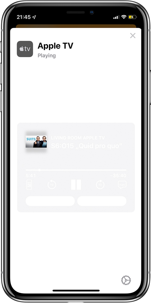
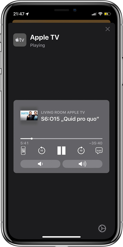
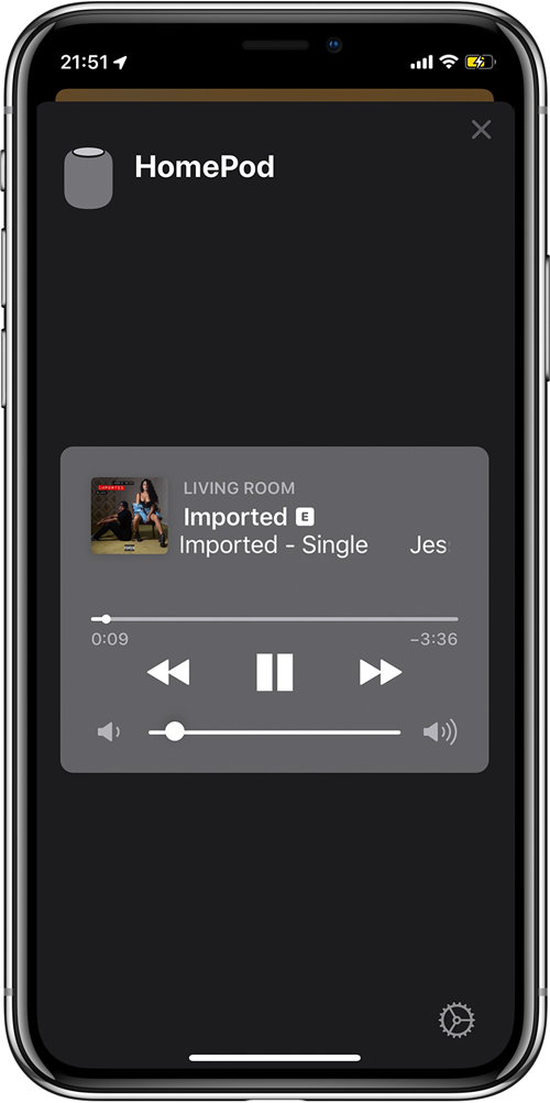
- The Apple TV and HomePod were included in the Home app last year, but in iOS 12, you were limited to pressing it, to play or pause the media being played. Now, if you long press on the respective icons, you get more control over what’s playing, with play and pause, as before, but also a slider to skim through the media, as well as a pair of buttons to skip forward or backwards 10 seconds at a time. There’s also a button that pulls up a fully-featured remote control, as well as a button for subtitles. Also included in the panel is a small preview image of the media being played, whether it’s a TV show or movie, or if it’s a song being played on your HomePod. As this is update still in beta there are some issues with visibility, so in the case of the Apple TV panel in light mode, their controls are barely visible compared to dark mode.
Apple TV and HomePod
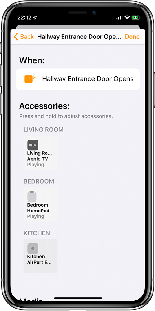
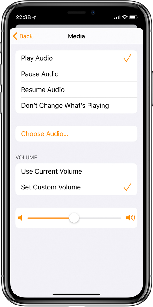
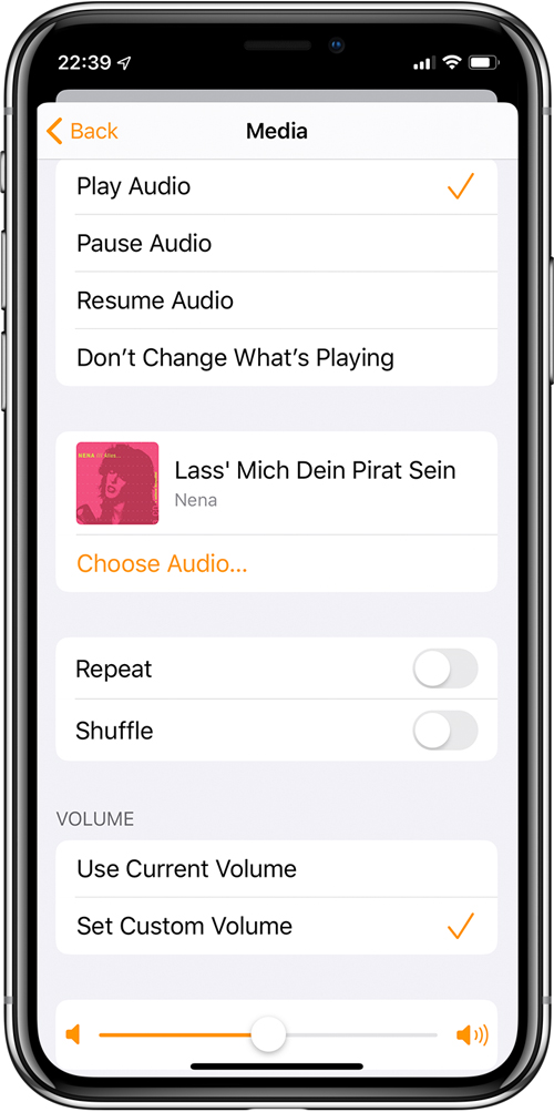
- The biggest change regarding HomePod and Apple TV is they can now be included in scenes. So, you can set a sensor to trigger either of these devices, whereupon they can play, pause or resume audio or video of your choice, as well as set a volume level. In the case of audio playback, you can choose from different sources, like your library or Apple music, including radio stations within Apple Music. Currently it seems you can play or pause video on Apple TV, but there are not currently any options to choose which media you want, unlike with Apple Music, although all the options already mentioned for Apple Music in automations still apply if you’re using your Apple TV to use audio as part of an automation.
Siri Shortcuts within Home
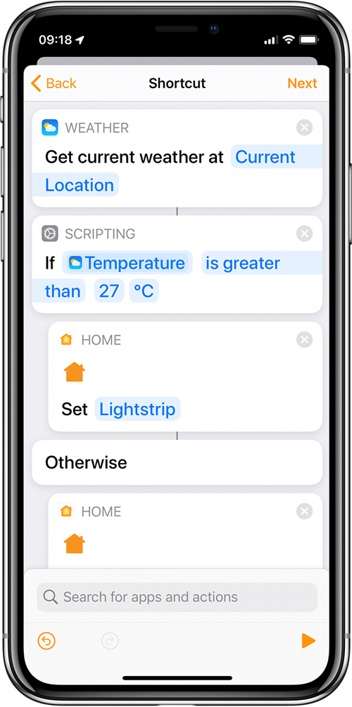
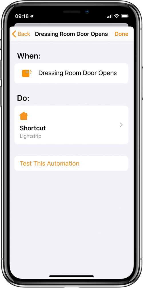
- Siri Shortcuts can now be accessed and included within automation in the Home app. However, at present, this part of HomeKit is far from complete, so we’re only going to show one cursory example at this time, with a view to doing a completely separate and more in-depth article later.
We’ll continue to update this article as and when things get updated with successive beta updates.
Thanks to Charles R. and mszfcz for the screenshots.











So far… I only have 1 Apple HomeKit… August… and doesn’t work that well…
Apple really have to make this better…
Aqara hub… failed to pair with HomeKit even I have purchased a NEW Aqara hub again…
The idea of camera is nice but… with the experience with August smart lock… I will not try it this time.
Can’t speak for HomePod (Sonos all the way over here) but I’m running the Aqara Hub for months with Homekit without any issues (multiple sensors)!
The August smart lock is a notorious piece of garbage. No one who uses HomeKit likes them. Get the Yale lock (and bridge) or the Schlage sense lock (bluetooth, works without bridge).
August are rubbish, so don’t base your HomeKit experience on that – I replaced mine with a Schlage and it’s 10 times better. My Aqara hub and other HomeKit devices are flawless. Make sure you update the firmware on the Aqara.
Another happy user with several Aqara devices and Koogeek devices too.
Jack, check all your devices are updated.
Regarding the article, my hands are hurting because so much applauses!
(I am missing some screen captures with Aqara devices ^_^U)
Siri Shortcuts for HomeKit looks to be everything we have been dreaming of for advanced automations. I hope it is.
Superbe article décrivant toutes les nouveautés présentes dans la prochaines mise à jour et de l’application MAISON, j’espère que d’autres fonctions de bases seront présentes également comme pour les capteurs de présences qui sont limités dans les réglages. Si aucune détection pendant 20min alors éteint telles ou telles lumières.
PS: Moi j’ai la serrure connectées DANALOCK et celle-ci fonctionne à merveille.
Merci encore.
Superb article describing all the new features in the next update and the application MAISON, I hope that other basic functions will be present also as for attendance sensors that are limited in the settings. If no detection for 20min then turn off such and such lights.
PS: I have the lock connected DANALOCK and it works perfectly.
Thanks again.
So the siren icon for the alarm will no longer exist?
Hi Daniel
I think the Alarm icon will still exist. This new tile is like the other tiles that represent a device with more than one ‘service’, so in the current beta of iOS13, you press on the tile to get access to the individual ‘services’ – in the case of the Aqara hub, you would see separate tiles for the light and the siren.
Pingback: Home iOS 13.3 Beta [Update] Trải nghiệm những thay đổi trên Home App
Are the camera notifications with live stream working for anyone?