Onvis 5-Key Switch w/ Thread (review)
Onvis are rightly more well-known to HomeKit users these days, thanks to their excellent Kameleon Light Strip (video HERE, review HERE), which I think is still the best multicolour-capable strip for the price right now. Some of their other devices, like the C3 Smart camera (video HERE, review HERE), come with great specs but sadly don’t seem to be getting much love, and their Bluetooth range of devices, whilst also very worthy, are, well…Bluetooth. Regarding the latter, the company has begun the move over to Thread, which is a good thing, with two devices – an update to their CT2 contact sensor (the CT3), and a brand new product, the HS2, or the 5-Way Switch, which we’re reviewing today. Read on…
PACKAGING/UNBOXING
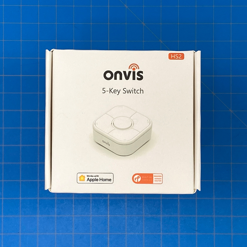
Whilst the product is the main concern of course, decent packaging can be of benefit in protecting the goods, and also give you the impression the company cares about how its product is presented, and Onvis does this well with the box on both counts. The device is shown on the front, with the new ‘Works with Apple Home’ badge, next to the Built on Thread badge, which is reassuring.
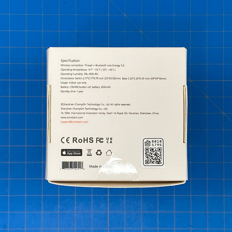
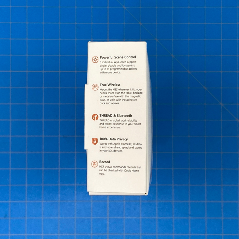
The side of the box outlines some of the features, like the five individual buttons each capable of triggering other devices via single, double, or long presses, as is standard for most HomeKit switches, as well as mentioning privacy via HomeKit (as it’s exclusive to HomeKit as it stands right now), and logs of button presses via the Onvis app. The rear lists the specs, which are;
- Wireless connection: Thread + Bluetooth Low Energy 5.0
- Operating temperature: 14ºF~113ºF (-10ºC ~45ºC)
- Operating humidity: 5~95% RH
- Dimensions:
- Switch 2.17 x 2.17 x 0.79 in (55 x 55 x 20mm)
- Base 2.32 x 2.32 x 0.39 in (59 x 59 x 10mm)
- Usage: Indoor use only
- Battery: CR2450 button cell battery, 650mAh
- Standby time: 1 year
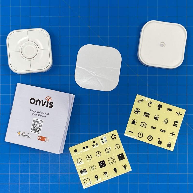
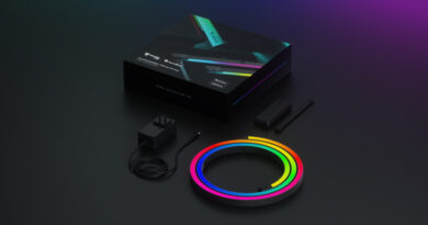
Inside the box is the switch (or button) itself, a magnetic base, a spare sticker for the base, a manual in a few European languages, and two sets of stickers with icons, designed to help you remember what you actually programmed each button to do!
THE SWITCH
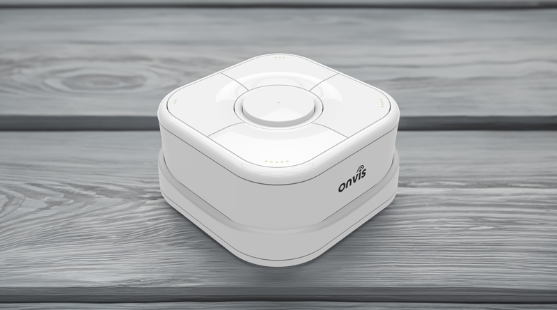
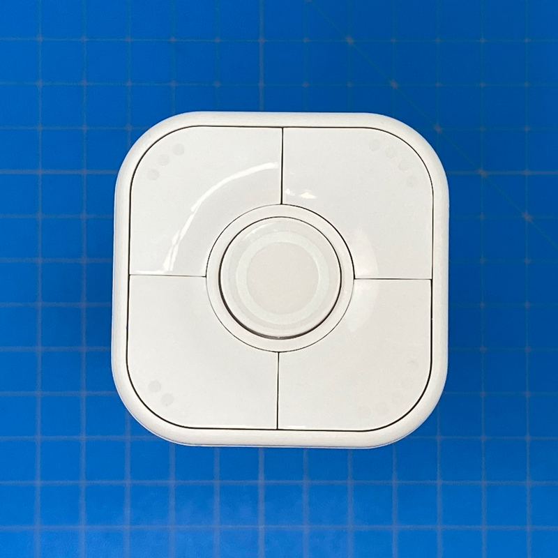
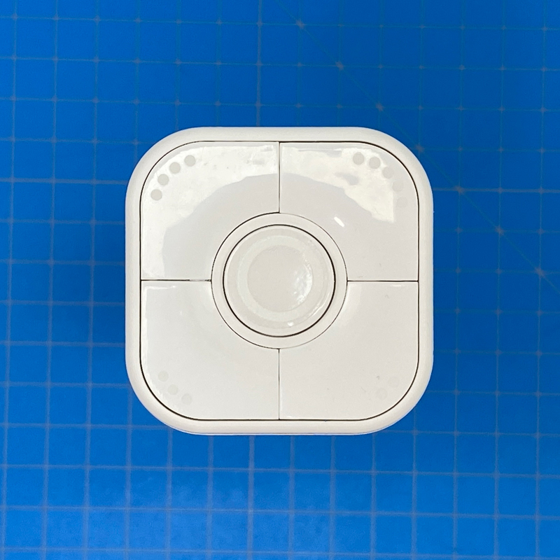
The switch is, to be fair, quite ‘chunky’ for want of a better word, but feels well constructed, which I think is of importance for something that’s going to get a lot of use, generally speaking. The front of the ‘switch’ is made up of 5 buttons – one for each corner, and a central round button, which is actually button #1, with the corner buttons being #2 through #5.
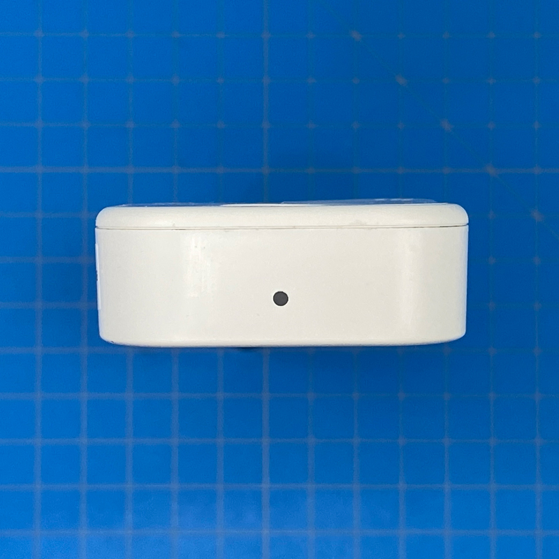
One edge features a small LED that flashes in one of three different colours, depending on the type of action;
- single press – white LED
- double press – green LED
- Long press – Blue LED
I’m not sure what benefit the LED provides, other than to confirm what action you chose to use, but then that would require you to be actively looking at the LED whenever you press it, so I’d suggest other than for testing purposes, this is only going to affect battery life, albeit maybe in a very minor way, perhaps.
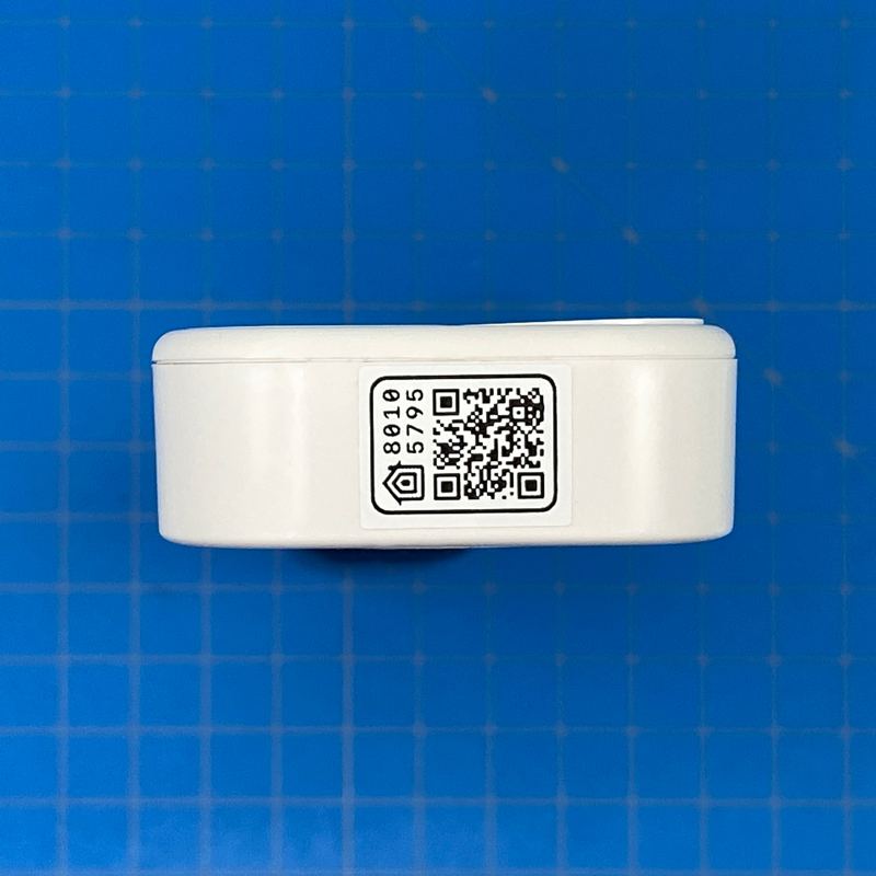
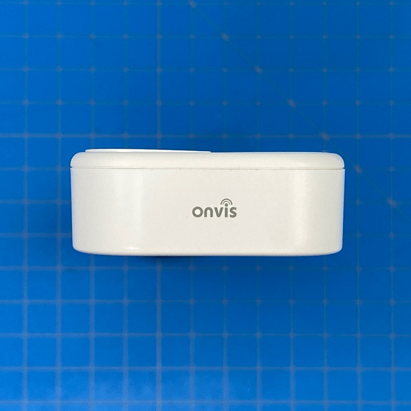
Another edge features the Onvis logo, which thankfully is a lot more discrete now compared to how large the logo was on their other products, most notably the CT2 contact sensor. On this point, it’s worth pointing out that whilst this review focuses only on the 5-Key Switch, I do review the new Thread contact sensor (CT3) in the accompanying video (see below), and they took the opinion on logo size seriously, with the CT3 now featuring a much smaller logo.
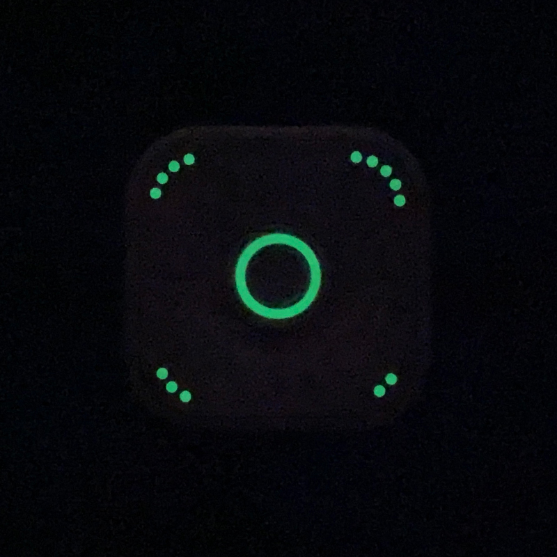
If you look carefully at the buttons, you’ll notice dots that correspond to the number of the particular switch, with a ‘ring’ for the central button. These are in fact luminous, so they’re visible in the dark, whilst not having any impact on battery life. I’m honestly surprised more companies don’t employ such a feature.
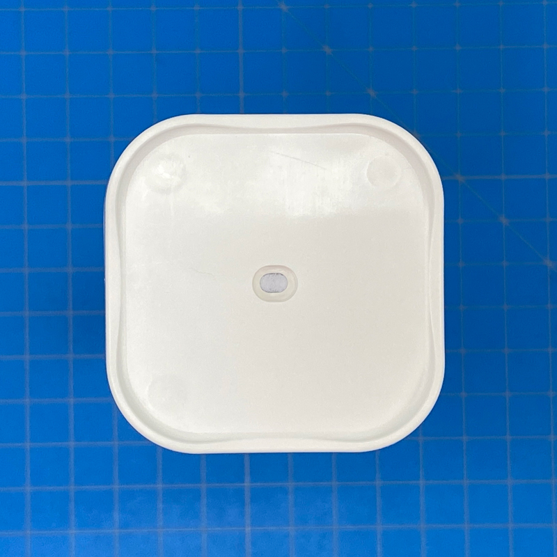
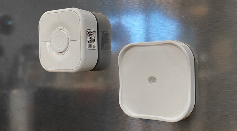
The switch comes with the previously mentioned magnetic mounting plate that can either be stuck to a surface with the sticker already present on the back of the plate or screwed to a wall etc using the provided screw and rawl plug.
You get an extra mounting plate sticker if required, but as both the plate and the switch are magnetic, you can also stick either or both to any metal surface, like a fridge door, as pictured above. By itself, the plate isn’t as strong when placed on a magnet-conducive surface, but combined with the switch, it holds up pretty well and doesn’t begin to ‘slide’ down a surface at all. The switch can also be stuck to a metal surface by itself and holds up slightly better than the mounting plate.
IN HOME | HOMEKIT
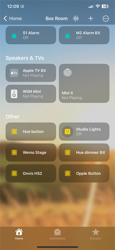
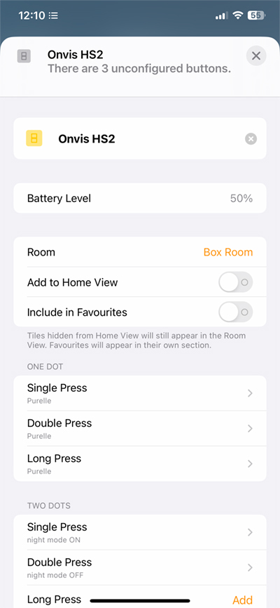
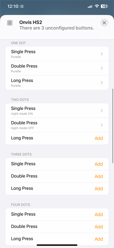
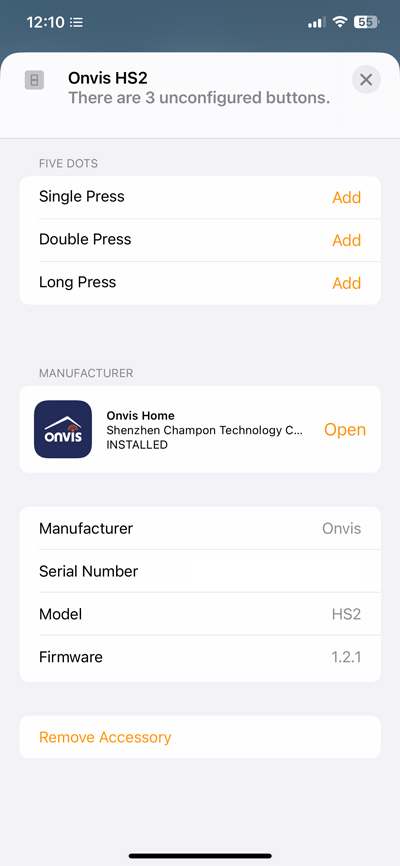
Adding to the Home app is as standard as it gets, and because it uses Thread, there’s no need to ensure you’re on a compatible WiFi band. As it uses Bluetooth for initial pairing, it can be slow to be added, but it gets there if you’re patient. Like pretty much all smart buttons (not Hue’s offerings, unfortunately), each button is capable of the standard three actions, so with 5 buttons to choose from, this gives you 15 different actions (or even more if you use time-based conditionals in third-party HomeKit apps).
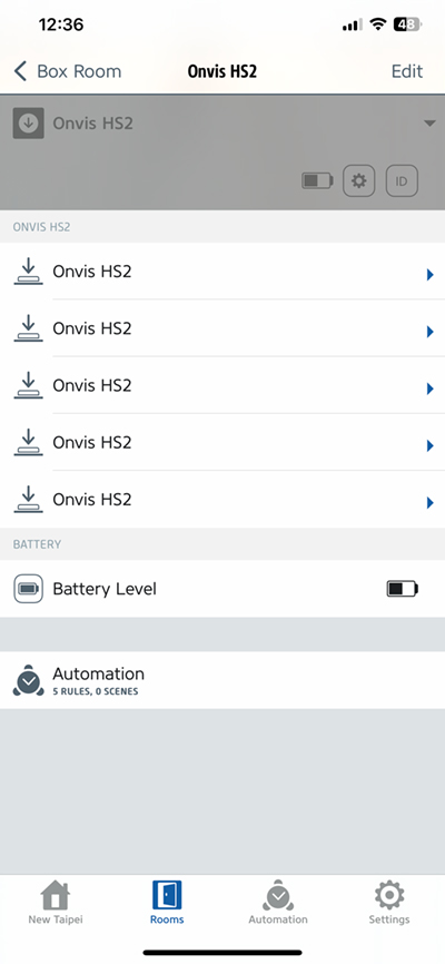
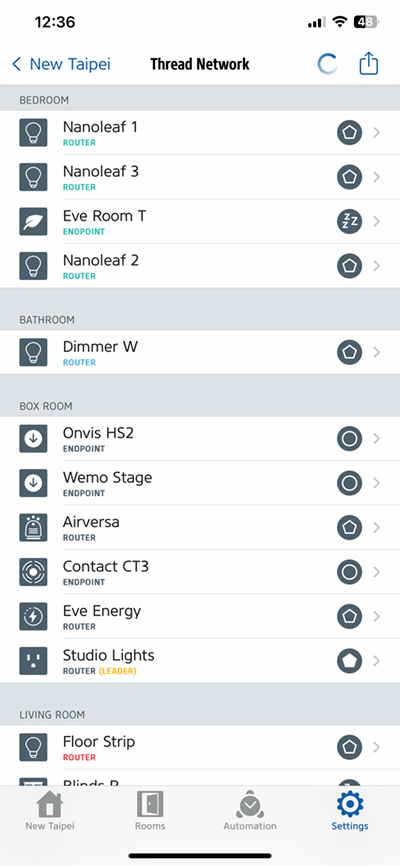
In the Eve app, you get the same options, although you also get to see more details on its Thread ‘credentials’ which can be viewed if you go into Settings > Thread Network, where all of your other Thread devices will be listed. You won’t be able to view Thread Border Routers (HomePod Mini or Apple TV 4K 2nd gen/3rd gen 128GB) unless you have at least one wired Thread-enabled device from Eve, like their smart switch or the Eve Energy smart plug. As you can see in the details for the HS2, it’s an endpoint or child device, as it’s battery-powered, which also means it’s not capable of spreading the Thread mesh network.
IN USE
I’ve been using the HS2 since December, and it hasn’t given me any issues at all, aside from the very rare instances of not seemingly registering a double-press, but other than that, it’s always showing as connected, and so far has not even had one of those instances where the reaction time is seriously delayed, which is something you’ll definitely encounter with Bluetooth devices eventually. One issue that initially plagued both the contact sensor and button was inaccurate battery levels, going as far as reporting battery levels dropping to 5% after very little usage. This isn’t the device eating through batteries, but a bug, which has since been rectified with firmware updates.
I’ll be honest and say there aren’t too many HomeKit devices or categories that get me excited right now, and smart buttons are certainly in this group. Still, as it has Thread, and doesn’t use Bluetooth (except for commissioning), it’s still worthy of some attention. When I posted about this button’s existence in the Summer, opinion was a little divided on the design, with many not really liking the ‘chunky’ nature of it. With the included plinth/wall mount, it is indeed ‘substantial’, although it’s actually the same size in two of its three dimensions as the Eve Button, which no one has claimed to be too large. The HS2 is definitely deeper than Eve’s Button, but not by much. I guess there’s a limit to what’s accepted, even if it’s just a few millimetres! Personally, it doesn’t bother me, and with it offering five buttons, I’m not sure there’s any other way to design such a switch, or indeed to fit in all the tech required. Compared to the Aqara Mini Switch, it is larger in all three dimensions, but then the Aqara doesn’t use Thread and only offers one button, just like the Eve. The only two devices that offer almost as much, or more, are the Aqara Cube T1 Pro (video HERE, review HERE), which has six ‘buttons’ (faces), and the Aqara/Opple 6-button wireless switch (review HERE). The Cube only offers one action per face/button, and the Aqara/Opple is a lot wider, being that it’s based on an ’86’ type switch.
The bottom line for me is that if a device has Thread, then I’m interested at a minimum if it’s going to be replacing a device using either Bluetooth or WiFi like the Airversa Purelle Air Purifier (video HERE, review HERE) has done. Whether it’s going to get a Matter update is of little consequence to me, although I can see why people want to see something that’s a little more future-proof, that’s a decision the individual has to assess.

